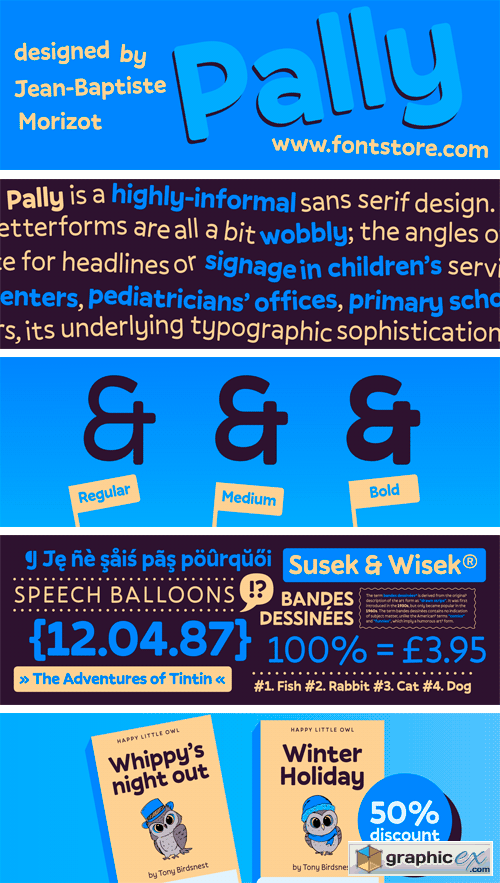

Pally Font Family
Pally is a highly-informal sans serif design. Its three weights were designed by Jean-Baptiste Morizot. Pally’s letterforms are all a bit wobbly; the angles of many letters’ strokes are atypical – just look at the capital ‘A’ – and the left and right-hand-sides of many letters are not the same size or height (e.g., the lowercase ‘a’ and ‘n’). As a result, Pally has a lot more character than most sans serif typefaces. It could be an excellent choice for headlines or signage in children’s services projects, like family centers, pediatricians’ offices, primary schools, etc. Once you begin to understand the different rhythm that Pally offers, its underlying typographic sophistication becomes clear. The ascenders of the lowercase letters, rise above the heights of capital letters and numerals. The lowercase alphabet includes a double-storey ‘a’, a single-storey ‘g’, and a Jensonian ‘e’, with a diagonal stroke in its middle-section. Each Pally weight has been drawn in a more-or-less monolinear fashion. In the fonts’ extended character sets, there is plenty of space between each letter and diacritics that come on top of it.
Download | Prefiles.com
Download | Rapidgator.net
Download | Nitroflare.com
Download | Turbobit.net
Comments (0)
Would you like to leave your comment? Please Login to your account to leave comments. Don't have an account? You can create a free account now.
 User Panel