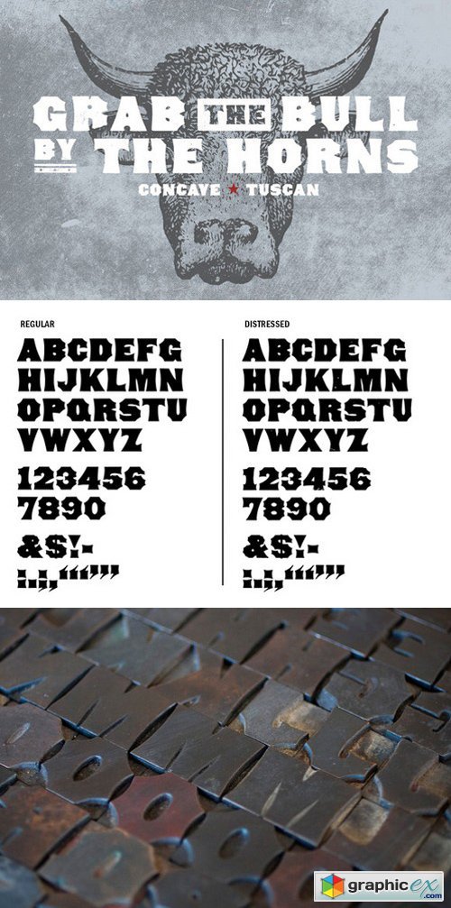
Concave Tuscan 287946
2 OTF| 275 KB RAR
Concave Tuscan is the perfect example of an American take on the Tuscan typographic style. Its wide strokes, tiny counters, and fanciful Tuscan-style contours give it incredible solidarity paired with a disarming friendliness.
Concave Tuscan was first shown as wood type under the name Gothic Tuscan by William H. Page in James Conner’s Sons Typographic Messenger (November, 1866). Almost all the major manufacturers of the 19th century offered a version of Gothic Tuscan.
The font includes two weights: regular and distressed. The regular weight is a clean, precise redraw which captures the contours of the original wood type. The distressed weight is a rendering of the the textures of the letterpress proof itself, warts and all. The distressed weight features alternate characters with extra dings and blemishes, set as the lowercase keyboard characters.
WTR Concave Tuscan was drawn from 6-line (72 point) wood type. It is a display face, and is best used at larger sizes.
Right now! Register a PREMIUM account on Prefiles For Fast Download
Download | Prefiles.com
Download | Rapidgator.net
Download | Nitroflare.com
Download | Turbobit.net
Download | Prefiles.com
Download | Rapidgator.net
Download | Nitroflare.com
Download | Turbobit.net
Dear visitor, you went to the site as unregistered user. We encourage you to create a free account and Login
Comments (0)
Information
Would you like to leave your comment? Please Login to your account to leave comments. Don't have an account? You can create a free account now.
Would you like to leave your comment? Please Login to your account to leave comments. Don't have an account? You can create a free account now.
 User Panel