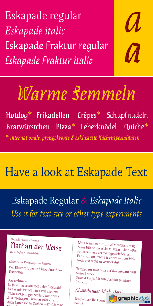
Eskapade Font Family
The Eskapade family is the result of research confronting Roman and German blackletter forms, mainly fraktur letters. The idea is to adapt these broken forms for a contemporary use instead of creating a faithful revival of a historical typeface. On one hand, Eskapade is conceived for continuous text in books and magazines with a good legibility in smaller sizes, and on the other hand Eskapade – especially the Fraktur – directs the readers attention in headlines with its mixture of round and straight forms, like in ‘e’, ‘g’ and ‘o’. It can also be used for visual identities, logotypes and packaging. Eskapade Roman adapts a humanist structure, but keeps it more condensed than other old-style serifs. The reason behind this stems from the idea to resemble closer the Fraktur style and to create a balanced harmony in mixed text-settings. Legibility is enhanced by a rather low contrast between thick and thin strokes and tall x-height. With its smooth design Eskapade offers an airy and light typographic colour. Eskapade italic is based on the Cancellaresca script and shows some particularities in its condensed and round forms. Its structure provided the base for Eskapade Frakur italic. Eskapade Fraktur is more contrasted and slightly bolder than the usual darkness of a regular weight. The innovative Eskapade Fraktur italic, equally based on the Cancellaresca script, is secondarily influenced, especially the capital letters, by the Sütterlin forms. A unique script practiced in Germany in the short period between 1915 and 1941. Although there are many typefaces in the fraktur style available, only a few of them include true italic forms. Those are more slanted uprights though, rather than proper italics. This motivated and made extensive experimentation with the italic shapes possible and resulted in some unusual and interesting solutions. In addition to standard capitals, Eskapade Fraktur regular and italic offer a second set of more decorative capitals with double-stroke lines for amplifying experimental use and creative application.
OTF | 4 Fonts | JPG Preview | 1 Mb RAR
Right now! Register a PREMIUM account on Prefiles For Fast Download
Download | Prefiles.com
Download | Rapidgator.net
Download | Nitroflare.com
Download | Prefiles.com
Download | Rapidgator.net
Download | Nitroflare.com
Dear visitor, you went to the site as unregistered user. We encourage you to create a free account and Login
Comments (0)
Information
Would you like to leave your comment? Please Login to your account to leave comments. Don't have an account? You can create a free account now.
Would you like to leave your comment? Please Login to your account to leave comments. Don't have an account? You can create a free account now.
 User Panel