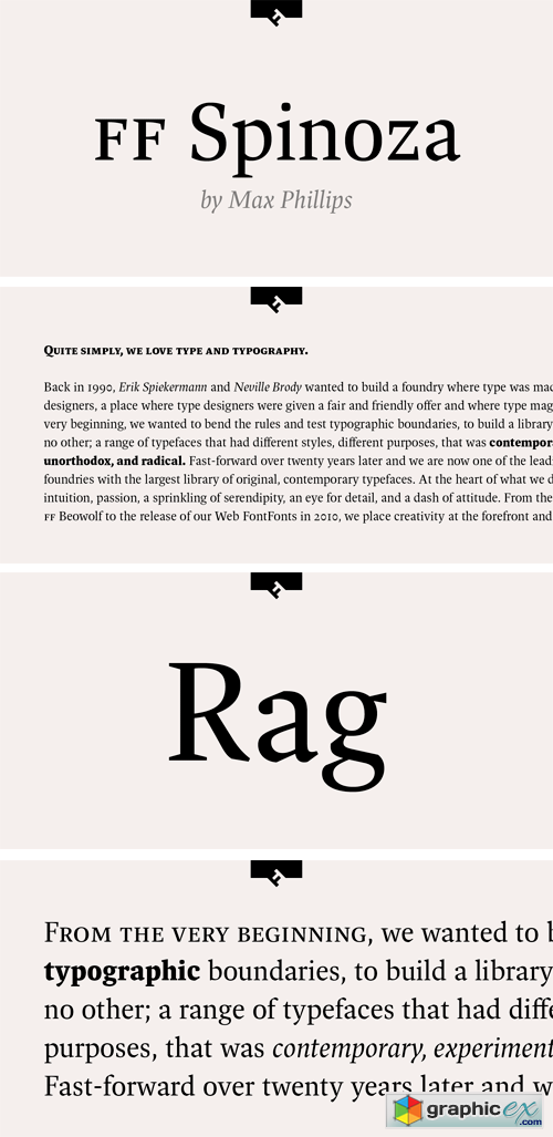
FF Spinoza Pro Font Family
11 years in the making, FF Spinoza is an elegant workhorse: crisp, sturdy, economical, and versatile. It was named after 17th century philosopher and lens-grinder Baruch Spinoza, who sought through both his professions to help people see clearly. A classic and highly readable Antiqua, it was inspired by the rigor of mid-century German text faces like Trump Mediaval and the lucidity of Janson revivals like Monotype Ehrhardt. Its x-height and aperture are generous, its proportions are compact, and its contrast is relatively low. Robust thin strokes and pronounced serifs and terminals make it suitable for setting in small sizes under challenging conditions, both in print and on the Web. Abruptly tapered junctures keep characters sharply defined and, in the heavier weights, create enlivening light traps. Substantial shoulders join branches and bowls firmly to their stems, which helps avoid the ‘picket-fence’ effect sometimes created by daintier typefaces. A comprehensive set of diacritics provides support for over 130 languages in the Pro version. Tabular figures are uniform in width across all weights to aid in the setting of columnar matter. Spinoza’s understated design makes it ideal for books and longer texts, but closer examination reveals distinctive details that suit it for advertising, branding, packaging, and other types of more highly flavored work. Its curves are subtly faceted, with extra corners and unexpectedly straight edges that add interest in display sizes and energy in text sizes. It has received Certificates of Excellence from the International Society of Typographic Designers and Communication Arts magazine.
OTF | 8 Fonts | + JPG Preview
Right now! Register a PREMIUM account on Prefiles For Fast Download
Download | Prefiles.com
Download | Rapidgator.net
Download | Nitroflare.com
Download | Prefiles.com
Download | Rapidgator.net
Download | Nitroflare.com
Dear visitor, you went to the site as unregistered user. We encourage you to create a free account and Login
Comments (0)
Information
Would you like to leave your comment? Please Login to your account to leave comments. Don't have an account? You can create a free account now.
Would you like to leave your comment? Please Login to your account to leave comments. Don't have an account? You can create a free account now.
 User Panel