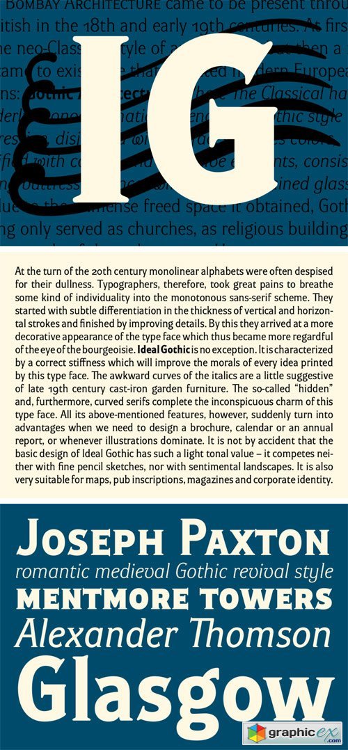
Ideal Gothic Font Family
At the turn of the 20th century monolinear alphabets were often despised for their dullness. Typographers, therefore, took great pains to breathe some kind of individuality into the monotonous sans-serif scheme. They started with subtle differentiation in the thickness of vertical and horizontal strokes and finished by improving details. By this they arrived at a more decorative appearance of the type face which thus became more regardful of the eye of the bourgeoisie. Ideal Gothic is no exception. It is characterized by a correct stiffness which will improve the morals of every idea printed by this type face. The awkward curves of the italics are a little suggestive of late 19th century cast-iron garden furniture. The so-called “hidden” and, furthermore, curved serifs complete the inconspicuous charm of this type face. All its above-mentioned features, however, suddenly turn into advantages when we need to design a brochure, calendar or an annual report, or whenever illustrations dominate. It is not by accident that the basic design of Ideal Gothic has such a light tonal value – it competes neither with fine pencil sketches, nor with sentimental landscapes. It is also very suitable for maps, pub inscriptions, magazines and corporate identity.
Download | Prefiles.com
Download | Nitroflare.com
Download | Turbobit.net
Comments (0)
Would you like to leave your comment? Please Login to your account to leave comments. Don't have an account? You can create a free account now.
 User Panel