
Amor Serif Font Family
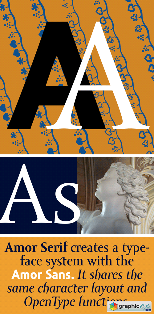
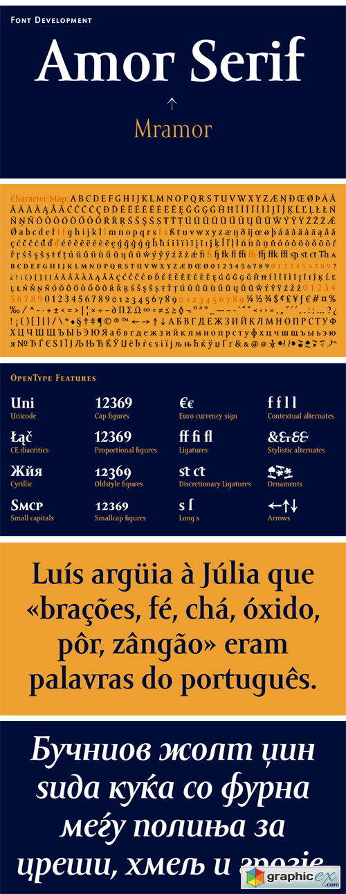
Monumental inscriptional majuscule originally carved in stone, sometimes called "Roman Capital", is a craddle of upper-case part of latin alphabet. Its narrowed form, derived from handwritten original used between first to third century A. C., served as inspiration to typeface Mramor, which I have drawn with ink on paper in 1988 under Jan Solpera's leadership. After composing negative letters on a strip of film there was possible to use Mramor through first phototypesetting devices. In 1994 with the help of Macintosh IIvi I have made also lower-case letters and bolds, and issued this typeface as 14-font family. After some years of using Mramor for various purposes, I realized a need of modernization and humanizing its very fragile appearance, as well as removing of numerous decorative useless parts. Besides that, type design made a huge technical progress in past few years, so I was able to finish the remaining cca 9600 glyphs contained in the present font system names Amor Sans & Serif Pro. It is already usual to combine sans- and serif fonts within one family, in order to distinguish historical part from contemporary, a plain chapter from a special one, or, in quotations, to divide speaking persons. Sans-serif typeface don't arise by simple removing serifs, it has to be drawn completely separeately, when ocassionally many declined forms may be made, considered to the serifed original. Neverteless, both parts of this type system appear consistent as for proportional, aesthetic and emotional atmosphere. Usage of type is often closely linked to its original inspiration, in this particular case with architecture and figurative sculpture. An inner "order" was also text setting in smaller sizes. A smooth scale of weights enriches the possibilities in designing of magazines, brochures, exposition catalogues and corporate indentity. Economizing, but opened shape of characters is well legible and antique hint comes into play after longer reading.
Download | Prefiles.com
Download | Rapidgator.net
Download | Nitroflare.com
Download | Turbobit.net
Comments (0)
Would you like to leave your comment? Please Login to your account to leave comments. Don't have an account? You can create a free account now.
 User Panel