9August2018

Aktura Font

Written by uploader. Posted in Font

Aktura Font

Aktura Font


Aktura is a medieval-style blackletter font. Its lowercase letters are a new digital/calligraphic take on traditional ‘gothic’ or textura-style forms. They look very much like the kinds of letters used on a lot of newspaper nameplates, or for certificate and diploma designs. Aktura’s uppercase is much more ornate; you could call the letters ‘lombardic’ capitals. Since gothic letterforms, historically speaking, were something of a unicase writing system – they were only really paired with matching caps after printing came along in the 15th century – Aktura reaches back to an occasional form of style-mixing practiced in the past, in which lombardic caps were used as the uppercase forms for gothic lowercase letters. The lombardic caps are so elaborate that they should almost never be used to set all-caps text; however, if you apply a lot of tracking, you might be able to get away with this for a logo, or in a headline that is about three-words-long. They will work just fine when they are used as presented in this font: as uppercase letters for otherwise mixed-case text. Aktura’s lombardic caps are a bit more calligraphic and playful than lombardic caps you might find in fonts based on more-specific historical source material. Like all ornamental capitals, Aktura’s uppercase can also be used as drop caps or initial letters for body text set in an otherwise completely different font, especially if that other font is a serif typeface, good for setting long passages of text.

9August2018

Segment Font

Written by uploader. Posted in Font

Segment Font

Segment Font

Segment is an LCD-style display font from Frode Helland, an Oslo based designer. True to its name, all of the letterforms in the font are constructed out of segments. This is a perfect choice for use in poster design, as well as for identity work for small businesses inside of cities with good public transit systems. The font would also work well in headlines for articles that touch on digital subjects. Despite the late-twentieth century technology whose style this font is based on, Segment’s design language is actually older and more eclectic. To begin with, for an experimental display font, Segment is most unusual because its letters have serifs. Its old-fashioned style is also particularly apparent in the top-half of the “7”, which approximates a wavy horizontal stroke, as well as on the bottom of the “2” and in the Pound Sterling currency symbol. The capital “R” has a long, sweeping diagonal tail. As you would expect from a classic electronic display font, Segment’s characters are monospaced. All of its glyphs share a common width. The font is also caps-only; the lowercase slots are filled with duplicates of the uppercase letters. None of the base letters like “J” or “Q” have descenders, but the design leaves ample room above and below for the diacritic marks required by various European languages. There are five glyphs in Segment representing the base grids on which either all, or some, of the “segments” in the font have been designed. The character set also contains over a dozen different currency symbols and two OpenType Stylistic Sets, which each offer alternate forms for the font’s range of punctuation marks.

9August2018

Passenger Serif Font Family - 14 Fonts

Written by uploader. Posted in Font

Passenger Serif Font Family - 14 Fonts

Passenger Serif Font Family - 14 Fonts

Passenger Serif is a Clarendon-style font family designed for use in long passages of text intended for immersive reading. It takes the idea of mid-nineteenth century English Clarendon types – like vertical axes of stress, lots of ball terminals, and chunky bracketed-serifs – and channels them into a face that is very legible in small sizes. It is comfortable to read, too. Passenger Serif is ready for use in editorial design, and for body text in novels and other books, too. The family includes seven weights, ranging in style from Extralight through Extrabold. Each weight has both an upright font and an italic on offer. The fonts’ default numerals are proportionally-spaced lining figures. Via the OpenType features, there are also oldstyle figures and tabular figures available, as well as a full range of numerators and denominators for typesetting fractions. The ascenders of the lowercase letters rise up above the tops of the capitals. In the upright fonts, the ‘a’ and the ‘g’ are double-storied. In the italics, they are single-storied. Each font includes 13 f-ligatures. Passenger Serif has a companion typeface available for larger-sized applications: Passenger Serif Display. Passenger Serif and Passenger Serif Display can be used together to powerful effect in magazine layouts, or in exhibition design graphics. The Passenger Serif families were designed by Diana Ovezea and Samo A?ko.

9August2018

Plein Font Family - 10 Fonts

Written by uploader. Posted in Font

Plein Font Family - 10 Fonts

Plein Font Family - 10 Fonts


Plein is a family of humanist-style sans serif fonts. The typeface’s clear and open forms are very legible and pleasant to read, too. The fonts’ letters are drawn with virtually monolinear strokes. The family has ten font styles available; there are five weights, ranging from Light to Black, and each weight has an upright and and italic font on offer. In Plein’s upright fonts, the lowercase ‘a’ and ‘g’ have double-storey forms; in the italics, these are single-storey. The stem of the ‘f’ in Plein’s italics descends below the baseline. The default numerals in the fonts are proportional oldstyle figures. Lining figures are also available, via an OpenType feature. The fonts also include case-sensitive punctuation, which can be substituted into all-caps text. Humanist sans serif typefaces are used in a wide variety of design projects today. Therefore, Plein is an excellent choice for work in branding and corporate design, but you could also use it to set texts of medium length in editorial design work. It might even be worth trying it out on signage and in navigation design projects. Plein comes from Inga Plönnigs, an independent type designer in Berlin and a graduate of the Type & Media program at the Royal Academy of Art (KABK) in The Hague.

8August2018

Associate Slab Font Family

Written by uploader. Posted in Font

Associate Slab Font Family

Associate Slab Font Family

Associate Slab is a large family of ten sans serif fonts. Part of FontStore’s larger ‘Associate’ type system, Associate Slab was developed as the slab serif counterpart for Associate Sans. Nevertheless, its fonts could be used entirely on their own, too. Like its relatives in the overarching Associate type system, Associate Slab is a typeface intended for Editorial designers.

8August2018

Syphon Font Family

Written by uploader. Posted in Font

Syphon Font Family

Syphon Font Family

Syphon is a family of sans serif fonts designed in the neo-grotesk style. It also includes a little kick, separating it from other typefaces in that genre: its diagonal letters feature stark contrast. The diagonals that are typically written with thin strokes in classic serif typefaces maintain thin strokes in Syphon as well, even in the family’s lightest weights. Speaking of weight, Syphon features ten font styles spread across five weights; these range from Thin through Bold.

8August2018

Folito Font Family

Written by uploader. Posted in Font

Folito Font Family

Folito Font Family

Folito is a modernist sans serif typeface. Its design combines typically grotesk-style letterforms, with some characters that are quite geometrically-designed. In terms of its appearance, Folito was inspired by Modernism and Industrial-Era graphic and typographic design. The family has five weights on offer, ranging from Light to Black. It is an excellent choice for use in branding, editorial, and poster design. Folito’s lowercase ‘a’ and ‘g’ are double-storied; however, single-storied alternates are available, through an OpenType feature.

8August2018

Astrup Font Family

Written by uploader. Posted in Font

Astrup Font Family

Astrup Font Family

Astrup is a rationalist sans serif typeface. Its letterforms feel like the France of the 1950s; they are very orderly, but also a bit spritely. The letters’ apertures are very small, making the counterforms in typeface feel like they are being completely enclosed within their surrounding characters. The Astrup family has six weights that range from Extralight to Bold. The lowercase letters’ ascenders rise up to the exact height of the tops of the capital letters.

8August2018

Indikator Font Family

Written by uploader. Posted in Font

Indikator Font Family 

Indikator Font Family

 Indikator is a family of humanist-style sans serif fonts. There are five weights in the Indicator family; these range from Light through Bold. Each weight has both an upright as well as an italic font on offer. The italic fonts contain slanted, or oblique-style letters. The letters in each of Indikator’s weights appear virtually monolinear, in terms of stoke contrast. Strokes end in either horizontal or vertical cuts, rather than in diagonals.

8August2018

Neco Font Family - 8 Fonts

Written by uploader. Posted in Font

Neco Font Family - 8 Fonts

Neco Font Family - 8 Fonts

Neco is a family of serif fonts, designed for use in headlines as well as smaller-sized texts of short and medium length. The fonts’ serifs have been designed with chunky, prominent wedge-shaped forms. The letterforms feature a diagonal axis of stress. As a family, Neco includes four weights, ranging from Regular through Black. Each weight has an upright and an italic font on offer. Neco’s letterforms have a high amount of stroke contrast, and the degree of contrast really increases from weight to weight. The Black and Black Italic fonts are particularly dynamic, in terms of their appearance. Neco’s lowercase letters have a tall x-height, and their ascenders rise up above the height of the fonts’ capitals. The letterforms in the Italic fonts are not oblique versions of the upright’s glyphs, but true cursive forms. The default numeral style in each font is proportional oldstyle figures, but tabular figures, lining figures, small cap figures, as well as a full range of numerators and denominators for typesetting fractions are in the character set as well. There are also several f-ligatures, substituted into the text by the fonts’ OpenType features. Neco is an excellent choice for use in editorial design, or for typesetting invitations and event-graphics. The fonts were designed by Jitka Jane?ková.

8August2018

Styro Font Family

Written by uploader. Posted in Font

Styro Font Family

Styro Font Family

Styro is a family of modernist-style stencil fonts. There are eight weights available, ranging in color from Thin through Black. All of the typeface’s weights are virtually monospaced, and with each weight of the family, the outside ‘strokes’ building up the letterforms increase in thickness. Styro’s characters are very condensed, and their design employs a reductionist formal vocabulary. For example, the counterforms are expressed by thin lines that run inside of the letters, from their tops to their bottoms. 

8August2018

Rustic Font Family

Written by uploader. Posted in Font

Rustic Font Family

Rustic Font Family

Rustic is a family of serif fonts ideal for use private-press—style book design, or in restaurant menu design. It is inspired by Ehmcke-Rustika, a 1914 typeface of Fritz Helmuth Ehmcke’s. The Rustic family includes five weights, ranging from Regular through Heavy. The default numerals in each font are proportional lining figures, but oldstyle figures are available via an OpenType feature. Each font also includes several Stylistic Sets. The first offers an alternate lowercase ‘e’, with a rounder beak.

8August2018

RX100 Font

Written by uploader. Posted in Font

RX100 Font

RX100 Font

RX100 is a monospaced sans serif font. Its letterforms are quite condensed, even for a fixed-width typeface. Because of its narrow width, the capital letters look particularly compressed, offering an interesting look in mixed-case text. RX100’s ascenders are quite tall; they really reach over top of the capitals. The same is true for the font’s diacritical marks: they are very large and will not be overlooked in a text – nor is one diacritical mark likely to be confused for another.

8August2018

Rowan Font Family

Written by uploader. Posted in Font

Rowan Font Family

Rowan Font Family

Rowan is a family of serif fonts intended for setting long passages of text for immersive reading. It can be used in both normal text sizes, and really small sizes, too. This is due to its particularly chunky serifs and stroke-endings. The family features five different weights, ranging from Light through Bold. Even in the Light weight, Rowan’s unique serif and stroke-ending-structure give the text a degree of visible stroke contrast. Each weight has an upright and an italic font on offer. The default numerals in each font are oldstyle figures; however, lining figures are also available via an OpenType feature.

8August2018

Ulm Grotesk Font Family

Written by uploader. Posted in Font

Ulm Grotesk Font Family

Ulm Grotesk Font Family

Ulm Grotesk is a family of geometric-style fonts for use at display sizes. Its design is so simplified that it feels quite futuristic. There are five weights on offer, ranging from Light to Extra Bold. The characters have been drawn with optically-monolinear strokes. The capital letters contain quite a lot of character; some of them are markant, too.

8August2018

Kola Font

Written by uploader. Posted in Font

Kola Font

Kola Font

Kola is a technoid stencil-style sans serif font. All of the stroke endings in Kola’s glyphs are rounded, and the overall effect of Paris-based type designer Jean-Baptiste Morizot’s stencilling is a bit reminiscent of the kind of lettering used on LED displays. Kola’s lowercase letters have a large x-height, and the ascenders rise up to the same height as the tops of the font’s capital letters and numbers. Despite the x-height being tall, Kola’s diacritical marks are still huge.

8August2018

Zanya Font Family - 5 Fonts

Written by uploader. Posted in Font

Zanya Font Family - 5 Fonts

Zanya Font Family - 5 Fonts

Zanya Font Family - 5 Fonts

Zanya Font Family - 5 Fonts

Zanya Font Family - 5 Fonts

TTF

8August2018

Marilyn Font

Written by uploader. Posted in Font

Marilyn Font

Marilyn Font

Marilyn Font

Marilyn Font

Marilyn Font

TTF

8August2018

Romantisk Font Family - 2 Fonts

Written by uploader. Posted in Font

Romantisk Font Family - 2 Fonts

Romantisk Font Family - 2 Fonts

Romantisk Font Family - 2 Fonts

Romantisk Font Family - 2 Fonts

Romantisk Font Family - 2 Fonts

TTF

8August2018

Velocity Font

Written by uploader. Posted in Font

Velocity Font

Velocity Font

Velocity Font

Velocity Font

Velocity Font

TTF

8August2018

United Stay Font

Written by uploader. Posted in Font

United Stay Font

United Stay Font

United Stay Font

United Stay Font

United Stay Font

TTF

8August2018

Under My Umbrella Font Family - 2 Fonts

Written by uploader. Posted in Font

Under My Umbrella Font Family - 2 Fonts

Under My Umbrella Font Family - 2 Fonts

Under My Umbrella Font Family - 2 Fonts

Under My Umbrella Font Family - 2 Fonts

Under My Umbrella Font Family - 2 Fonts

TTF

8August2018

Boeing 24 Font

Written by uploader. Posted in Font

Boeing 24 Font

Boeing 24 Font

Boeing 24 is a caps-only display font. Its letterforms are sans serif, and they look like they come from a monospaced font. However, Boeing 24’s monospaced-appearance is just a strong look ; in actuality, its letters have proportional widths. These appear quite industrial and constructed, too – almost as if they had been made by a machine, rather than by Deni Anggara, the Bandung/Indonesia-based type designer behind Boeing 24.

8August2018

Claire Font Family - 12 Fonts

Written by uploader. Posted in Font

Claire Font Family - 12 Fonts

Claire Font Family - 12 Fonts


Claire is a family of fonts with sturdy serifs. Several of the weights in the family are optimal for setting large amounts of running texts; the extreme light and heavy fonts, on the other hand, work great together in display applications. The letterforms in Clair have a vertical axis, and their design is reminiscent of contemporary newspaper fonts, as well as late-nineteenth century typefaces along the Century model. Claire includes 12 styles ranging in weight from Thin to Black. Each of those six weights has a companion italic font, too. Claire’s letterforms feature thick slab-like serifs that are bracketed onto their stems. Since the proportions of its uppercase letters are nineteenth-century, they optically feel like they are all almost the same width. The same is true for the numerals, which share the same height as the capitals. The numerals include nice, decorative features, such as flag-like strokes on the bottom of the ‘2’ and the top of the ‘7’. The ascenders of Claire’s lowercase letters rise slightly above the tops of the uppercase letters and numerals. Claire}s x-height is also rather tall. The lowercase ‘g’ in the upright fonts, which is double-storey, has a lovely ear that ascends above the x-height. In the italic fonts, both the ‘a’ and the ‘g’ are single-storey. The italic letterforms also feature especially-prominent ball terminals. Claire is the work of a team of Paris-based type designers including Jérémie Hornus, Gaetan Baehr, Jean-Baptiste Morizot, Alisa Nowak and Théo Guillard.

8August2018

Gambarino Font

Written by uploader. Posted in Font

Gambarino Font

Gambarino Font

Gambarino is a condensed, single-weight serif face for headlines. The font is designed by Théo Guillard. Stylistically, you could call it a post-modern interpretation of the Garalde genre.

8August2018

Cosmetic Font Family

Written by uploader. Posted in Font

Cosmetic Font Family

Cosmetic Font Family

 Cosmetic is a very high-contrast family of sans serif fonts. As its name implies, it has been developed for exquisite applications, like the corporate identity of fashion or beauty product firms, or for cosmetic product packaging design. For centuries, the fashion world has looked to France for inspiration. 

8August2018

RAY Font Family - 5 Fonts

Written by uploader. Posted in Font

RAY Font Family - 5 Fonts

RAY Font Family - 5 Fonts

Ray is a light-hearted family of display fonts. Its letterforms were inspired by the kind of typefaces used on digital displays. The family includes five variants, each of which shares the same character width, inter-character spacing, and OpenType features. They are each derived from a strict grid. Ray One’s letterforms make use of a series of dots overlayed on top of a background grid. The capital letters, lining figures, and lowercase ascenders are nine dots tall. The x-height is seven dots. The descenders have two dots worth of space available below the baseline. The Ray Two fonts uses squares instead of dots. These all run into each other, but still present a pixelated effect to the texts they set. Those squares are rounded off in Ray Three, making this style appear like a combination of the Ray One with the Ray Two font. Ray Four adds bridges between many of the gaps found between the grid units visible in Ray Three. These rounded elements from Ray Four are in turn re-squared in Ray Five, making that font look like a cross between Ray Two and Ray Four. The fonts in the Ray family include both lining and oldstyle figures, as well as several alternates for letters like the ‘Q’, ‘R’, ‘S’, and ‘g’. Ray come from Satya Rajpurohit, the Ahmedabad-based type designer who co-founded the Indian Type Foundry.

8August2018

Monorama Font Family - 4 Fonts

Written by uploader. Posted in Font

Monorama Font Family - 4 Fonts

Monorama Font Family - 4 Fonts

Monorama is a family of caps-only display fonts. Its letterforms are sans serif and quite industrial-looking. While text set in the four Monorama fonts appears at first glance to be monospaced, that is just a strong look ; in actuality, the letters have proportional widths. Monorama contains a number of constructed-design hallmarks. The fonts’ ‘M’ and ‘W’ share a nearly-identical form, rotated 180°. Letters that are traditionally rounded, like the ‘C’ or the ‘O’, are all straight-sided. In fact, the Monorama fonts do not include any curves in at all. Stroke-endings are mostly modulated, looking a bit like the ends of strokes in ‘rounded’ fonts (but also like ‘college’ or sports fonts). The ‘Q’ doesn’t descend below the baseline, but still has a tail. The ‘J’ has a non-descending tail of its own, too. The zero features a slash inside of its counter to distinguish it from the ‘O’. Monorama includes a full range of numerators and denominators for typesetting fractions, as well as ten directional arrow glyphs per font. Each font also has two different ampersands to choose from. Monorama is an excellent choice for headline-typesetting and logo design, but will certainly be used for concert and event flyers, too. It would even be great for branding a sports team. Monorama was developed by Deni Anggara, a type designer based in Bandung/Indonesia.

8August2018

Sharpie Font Family - 5 Fonts

Written by uploader. Posted in Font

Sharpie Font Family - 5 Fonts

 Sharpie Font Family - 5 Fonts 

Sharpie is an informal family of script fonts. It includes five different styles, ranging in weight from Light to Black. The typeface, named after a kind of marker, looks very sign-painterly – almost as if its letters had been written out quickly with a flat brush. All of its letterforms are slanted, and they do not connect with the characters that come before or after them. Sharpie’s strokes are very angular in their appearance. The stroke-contrast is rather modest in the Light weight, but by the Black, it is very strong (really quite awesomely so). Sharpie’s lowercase letters don’t have a very tall x-height. The tops of the ascending-lowercase letters, the capitals, and the numerals all rise to about the same point. The ‘a’ and the ‘g’ in Sharpie are both single-storey in their forms. The typeface is designed by Théo Guillard.

8August2018

Locomo Font Family - 7 Fonts

Written by uploader. Posted in Font

Locomo Font Family - 7 Fonts

Locomo Font Family - 7 Fonts

Locomo is a seven-weight family of constructed sans serif fonts. The sides of each letter in Locomo are flat. Many of the typeface’s characters have rounded tops and bottoms; however, in the case of letters where these are traditionally flat – like in ‘E’, ‘F’, ‘I’, ‘L’, and ‘T’ – Locomo keeps these flat, too. The family’s range of weights begins with Extralight and expands to Black. In all of the fonts, characters are drawn with monolinear strokes. In each of the weights, the fonts’ inter-character spacing is very tight. Locomo is a little wide, especially in the lowercase. The lowercase letters also have a tall x-height. For their design, simple forms have been favored. The ‘a’ and the ‘g’ are both single-storey, for instance. Jean-Baptiste Morizot designed Locomo for display applications; the larger the size, the better. This will give Locomo’s unique design language enough space to make the intended statement

8August2018

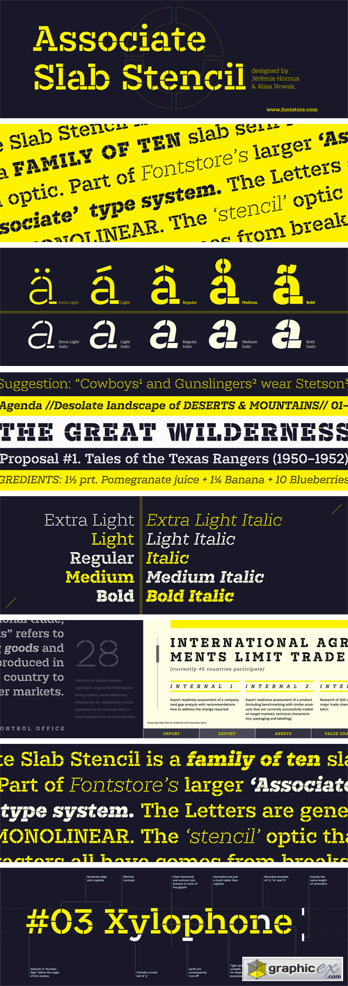
Associate Slab Stencil Font Family

Written by uploader. Posted in Font

Associate Slab Stencil Font Family

Associate Slab Stencil Font Family

Associate Slab Stencil is a family of ten slab serif fonts with a stencil optic. Part of FontStore’s larger ‘Associate’ type system, Associate Slab Stencil is an extension of the Associate Slab design for use in headlines and logos. The Associate Slab Stencil letters are generally monolinear. The ‘stencil’ optic that the characters all have comes from breaks, or ‘bridges,’ applied to parts of each letter.

8August2018

Pramukh Font Family

Written by uploader. Posted in Font

Pramukh Font Family

Pramukh Font Family

Pramukh is a very condensed sans serif typeface. As a family of fonts, it is particularly large; its 16 styles include a range of eight weights: ExtraLight, Light, SemiLight, Regular, SemiBold, Bold, ExtraBold, and Black. Each weight has a companion italic font, which is oblique in style. Pramukh makes use of a very modernist typographic vocabulary. As a result, the typeface is in an excellent choice for corporate identity and editorial design projects where a formal sans serif is needed, especially one whose narrow letters can pack a lot of text into a tight space. 

8August2018

Associate Sans Mono Font Family

Written by uploader. Posted in Font

Associate Sans Mono Font Family

Associate Sans Mono Font Family

Associate Sans Mono is a family of ten sans serif fonts, in which all of the letters are monospaced. Each of the characters in the family’s fonts share the same common width; the capital ‘W’ is just as wide as the lowercase ‘i’. Indeed, the same character width is used for all of the glyphs in each of the family’s ten fonts. Designer can swap out text set in Associate Sans Mono’s ExtraLight weight for letters from the Bold Italic font, without text-length or line-wrap being affected at all.

8August2018

Litmus Font Family - 5 Fonts

Written by uploader. Posted in Font

Litmus Font Family - 5 Fonts

Litmus Font Family - 5 Fonts

Litmus is the newest typeface from Fontstore founder Satya Rajpurohit. It is a slightly condensed humanist sans serif design, with a tall x-height and strokes that end with either horizontal or vertical terminals, instead of diagonals. Ascenders rise noticeable above the tops of capital letters, while the fonts’ numerals are slightly shorter than the caps. Litmus’s interior counterforms are rather open. There are five weights on offer: the Light is monolinear, but the stroke-contrast grows with every weight. The amount of contrast in the Bold is quite high. Each Litmus font makes use of a double-storey ‘a’ and single-storey ‘g’. The fonts may be put to excellent use for text on websites, or in print – especially in documents where a little space-saving is necessary.

8August2018

Snooze Font Family - 3 Fonts

Written by uploader. Posted in Font

Snooze Font Family - 3 Fonts

Snooze Font Family - 3 Fonts

Snooze is a fun, three-weight font family that looks like the numbers from your alarm clock. That’s right, Snooze is an LED-style typeface! These gained popularity in the home on appliances decades ago, but have since been used all over our urban environment for displays inside buses, tram cars, trains, etc. While there are plenty of LED-style fonts available, Snooze is rather unique in that its design exists in multiple weights: Light, Regular, and Bold. But that isn’t its only variety on offer: each font includes a range of alternate numerals in a Stylistic Set. So there are two options for each of the ten digits! This will help you fine-tune whatever LED-style design you’re working on, whether it is a printed advertisement, or the timer inside a mobile app. Snooze is designed by Morgane Pambrun


TOP