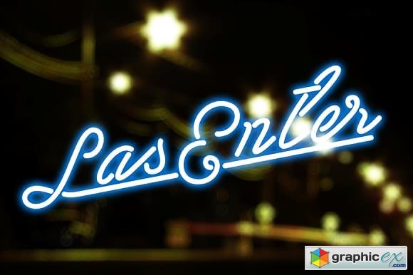
Las Enter Fonts Script 1120727
TTF, OTF, All Files
BUNDLE Microsoft SurfaceBook MockUp
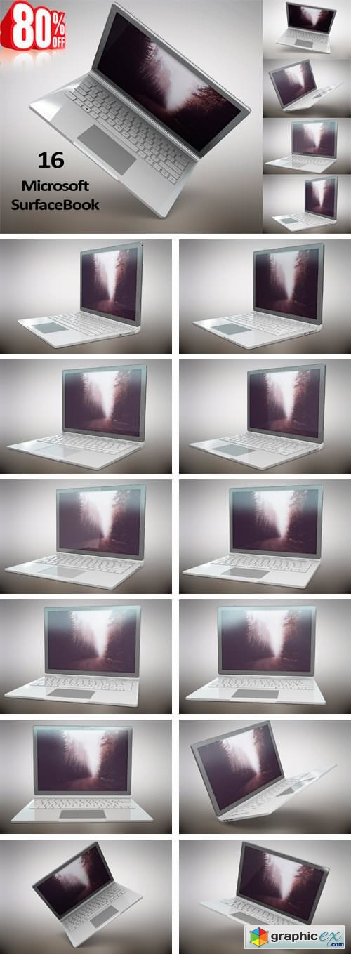
BUNDLE Microsoft SurfaceBook MockUp 1660175
Professional premade scenes, great for your web design showcase, product, presentations, advertising and much more.
Coffee cup mockup. Product mockup
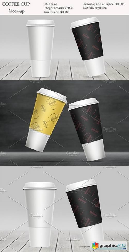
Coffee cup mockup. Product mockup. 1654632
PSD | 1.6 MB RAR
You can easily move objects, overlay your own patterns and logos and demonstrate it in best view.
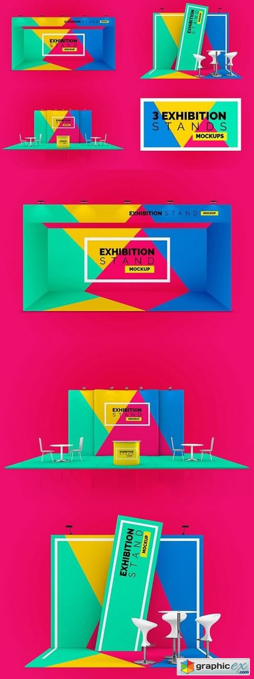
Exhibition Stand Mockup 1643256
PSD | 84 MB RAR

A4 Mockup 1636884
PSD | 967 MB RAR

Wall Art Mockups BUNDLE V49 1644839
PSD | 821 MB RAR
This wall mockup pack allows you to quickly display your designs and layouts into a digital photo realistic showcase. Please note that you must have basic photoshop knowledge to use this project. Video tutorial is included.

Wall Clock Mockup Template 1643495
PNG | 83 MB RAR

Material Bag Mock-up 20403953
PSD | Pixel Dimensions:4000x2670 | 1.5 GB
Monthly Planner 2018 (MP14)

Monthly Planner 2018 (MP14) 1683390
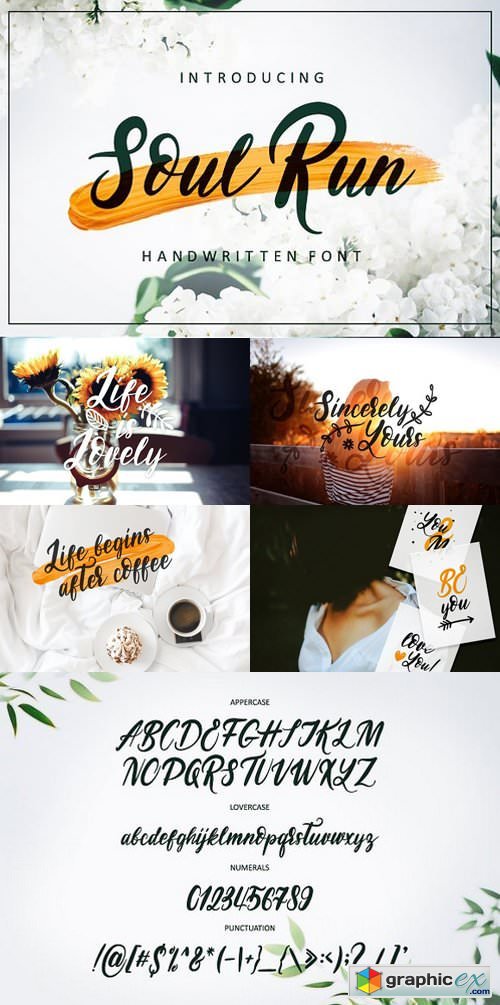
Soul Run Brush Font 1635621
WOFF OTF TTF | 493 KB RAR
Hello everyone! I am very pleased to introduce to you my new handdrawn font SOUL RUN! Font perfectly combines the smoothness of lines, connections and slopes. Suitable for designing projects, creative works, wedding invitations, for signatures to your memorable photos and creating postcards.
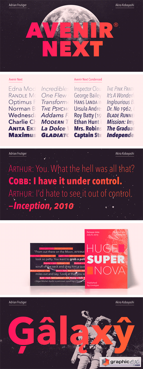
Avenir Next Pro Full Family
Avenir Next Pro is a new take on a classic face—it’s the result of a project whose goal was to take a beautifully designed sans and update it so that its technical standards surpass the status quo, leaving us with a truly superior sans family. This family is not only an update though, in fact it is the expansion of the original concept that takes the Avenir Next design to the next level. In addition to the standard styles ranging from ultra light to heavy, this 32-font collection offers condensed faces that rival any other sans on the market in on and off—screen readability at any size alongside heavy weights that would make excellent display faces in their own right and have the ability to pair well with so many contemporary serif body types. Overall, the family’s design is clean, straightforward and works brilliantly for blocks of copy and headlines alike. Akira Kobayashi worked alongside Avenir’s esteemed creator Adrian Frutiger to bring Avenir Next Pro to life. It was Akira’s ability to bring his own finesse and ideas for expansion into the project while remaining true to Frutiger’s original intent, that makes this not just a modern typeface, but one ahead of its time.
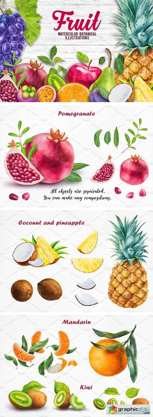
Watercolor Fruits Collection 1657955
Fruit. Watercolor botanical illustrations. Have a look at our brand-new collection of tropical fruits illustrations! These juicy paintings will definitely make you hungry and thirsty. We have worked hard harvesting them for you into one brilliant masterpiece, the fruits came out very detailed and realistic, you can almost feel the textures. These fruit illustrations can be a perfect addition to a restaurant’s or café’s menu or printed on walls, creating a tasty atmosphere. As well they can be used as cards, banners, be a part of your logo or project. This collection includes fruits such as: plum, pineapple, pomegranate, citrus, purple mangosteen and many other. They will also look fabulous on packages designs. You can find nearly everything that is relevant to fruits in this collection. These hand-drawn illustrations pack a punch. I use only the highest quality watercolors for vibrant hues and rich saturation, and premium paper for a pleasing watercolor texture. It's charming art, not digital embellishment. Offering unique illustrations from the artist's hand, vectorized and optimized for your digital and print products. Formats: JPG, PNG and Ai. All images are in high quality and large size. Enjoy!
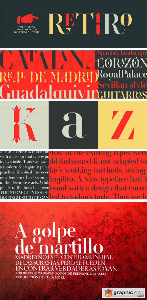
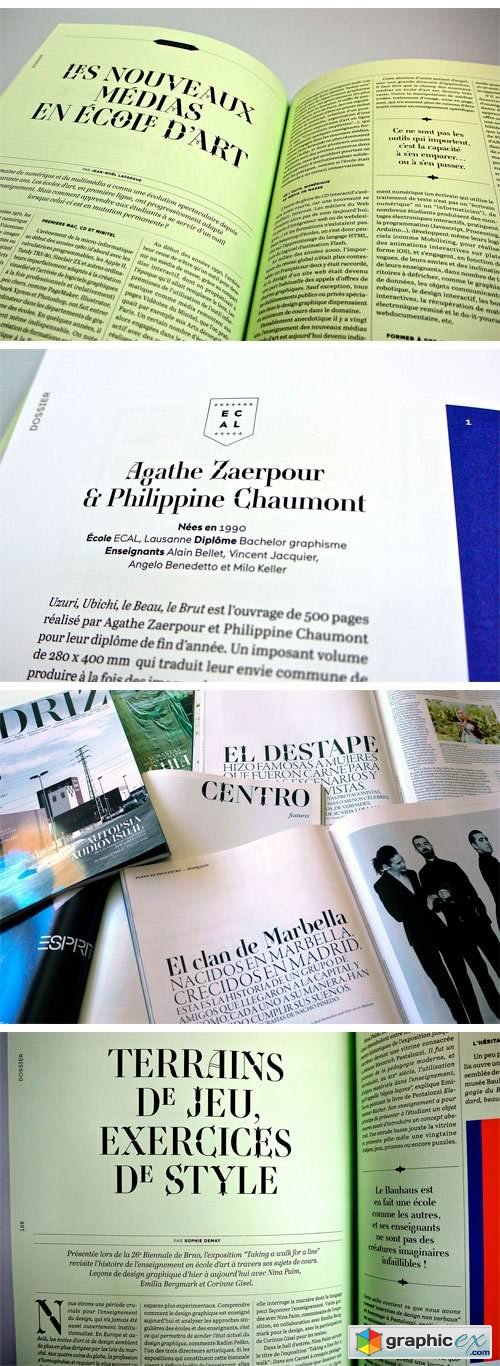
Retiro Font Family
Retiro is a daring interpretation of Spanish typography. Severe, austere and yet, full of life, Retiro is a vernacular version of Castilian and Andalusian in a typical Didot. Named after a lovely park in Madrid, Retiro started life as a a bespoke typeface designed to give a unique voice to the magazine Madriz. In 2006, the founder of Madriz was looking for a Didot for his new magazine. The Didot is the archetypal typeface used in high-end magazines. Retiro, based on Ambroise is a synthesis of these high contrast styles mixed with an Hispanic mind. Result is then, after 2-3 years of work, a typeface with countless variations – Retiro in 2009 included 470 glyphs – to establish typographic shades adapted to different sections and pages of the Madriz.


Handwritten Font Pack & Extras 1681441
As a launching promotion (till 1 August) you can buy Handwritten Font Pack & Extras for the incredible price of just $18 (normal price $22). So hurry up and grab this ultimate handwritten pack and start designing that cool stuff you always wanted :) Handwritten Font Pack & Extras is a unique pack that contains 13 Fonts grouped in 8 Font Families, 6 Super Cute Logos and a Big Pack of Doodles. All the fonts are coming in OTF, TTF and WOFF format, so you don’t have to worry for not having the right format for your next design project. Both the 6 Premade Logos (Fully Editable) and the Big Pack of Hand Drawn Doodles are in PSD and AI vector format (Stroke version included – for Doodles pack).
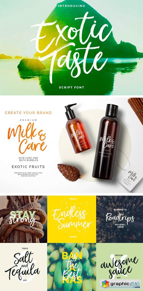
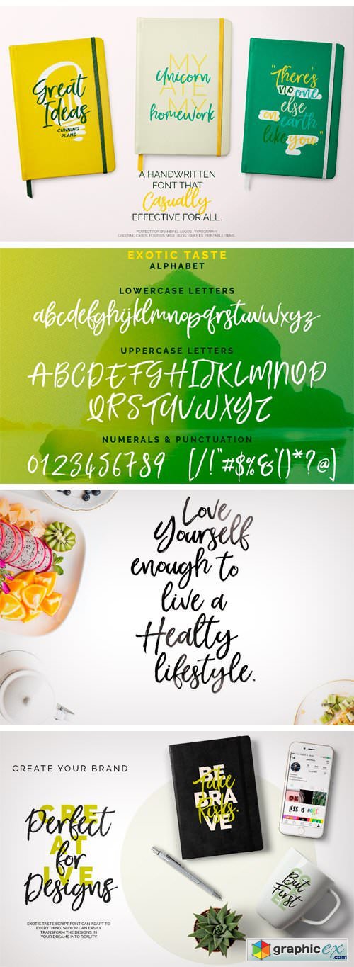
New! ExoticTaste Script Font 1682085
Introducing New! Exoic Taste Script Font. Every detail is natural and exotic. Carefully made. You can create your own designs with the fluff and natural texture. It's the perfect choice for personal branding projects, handwritten quotes, homeware designs, product packaging - or simply as a modern & stylish text overlay to any background image. If you are a social media geek, you are getting the right file. Because you will get boost your blog or page with this font. You can choose from a wide variety of designs, from greeting card designs, poster / flyer designs, apparel / t-shirt designs to web designs.

Camelone Typeface 1684026
Can be used for various purposes namely headings, logos, wedding invitations, t-shirts, letterheads, signages, labels, news, posters, badges etc.

Scania Sans Font Family
With the aim to be the leader in sustainable transport, Scania builds its business while creating value for customers, employees and society. Delivering customised heavy trucks, buses, engines and services, focus is always on efficient, low-carbon solutions that enhance customer profitability. With design direction by Brand Union Stockholm we have developed a wide type family with 8 styles and updated the classic word mark.

Miss Zippy | Chic Typeface 1654821
TTF OTF WOFF | 192 KB RAR
This font are perfect for wedding invitation or your blog. Also with their help, you can create a logo or beautiful frame for your home. Or just use for your small business, book covers, stationery and more. You can make compositions from font, it's easy and simple.

Bespoke Sans Font Family
Bespoke Sans is family of humanist sans serif fonts. They feature large, open counterforms, which hep maximise the typeface’s legibility in text. The family includes five weights, ranging from Light through Bold. Each weight has an upright and an italic font on offer. The tops of the Bespoke Sans’s lowercase ascenders all end in diagonal shears. This kind of diagonal stroke-ending is visible throughout the typeface’s design. It acts as a subtle reference to the kind of broad-pen that could be used to write Bespoke Sans’s letterforms out. The lowercase ‘a’ and ‘g’ in the five upright fonts are double-storied. In the italic fonts, these become single-storied. The fonts’ numerals are proportionally-spaced oldstyle figures, which harmonise especially well with the lowercase letters. Bespoke Sans is an excellent choice for use in branding, corporate communication, editorial design, and even in signage and wayfinding systems. It gets a text’s message across quickly – no matter if the text is long or short – without sacrificing its own unique and inherent voice.

Brush Typeface 1655142
TTF OTF WOFF | 269 KB RAR

Splodge Typeface 1655162
TTF OTF WOFF | 146 KB RAR

Toy Cartoon font 1655163
TTF EPS | 470 KB RAR
Toy Cartoon font is a simple playful cartoon font. An excellent choice for birthday cards, invitations and party posters. Best for children related goods and designs.

Amber Font 1111507
OTF
AMBER
A handcrafted modern sans serif font. Perfect for all purposes. Pairs well with script fonts.
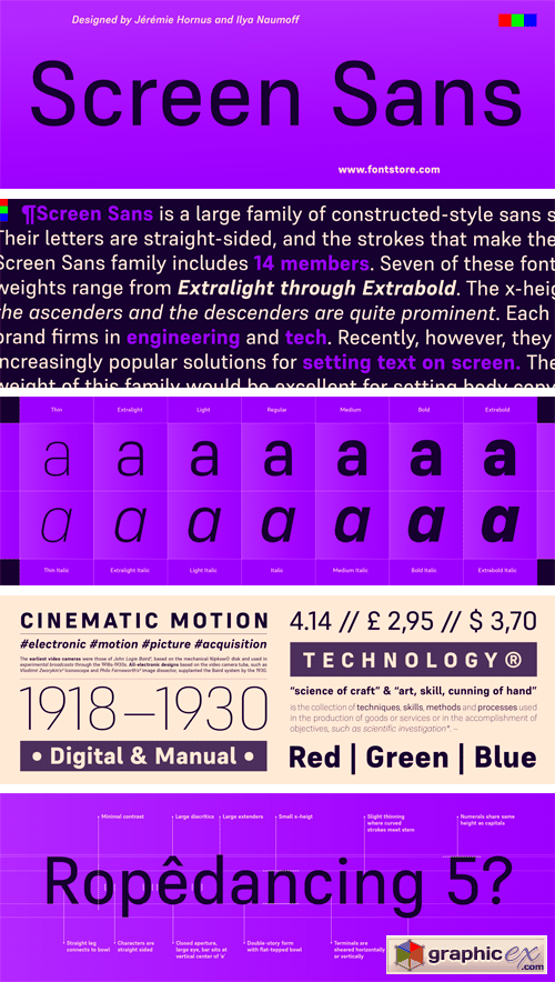
Screen Sans Font Family
Screen Sans is a large family of constructed-style sans serif fonts. These fonts feature forms that look like those that have been favored by engineers for over a century. Their letters are straight-sided, and the strokes that make them up are monolinear. The Screen Sans family includes 14 members. Seven of these fonts are italics, although these italic fonts should really be called ‘obliques,’ as the letters are slanted versions of what you’ll find in the upright fonts. The family’s weights range from Extralight through Extrabold. The x-height is moderate, so the ascenders and the descenders are quite prominent. The ascenders rise above the capital letters and the numerals – both of which share the same height. Each font uses a double-storey ‘a’ and single-storey ‘g’. Years ago, fonts like Screen Sans were primarily used to brand firms in engineering and tech. Recently, however, they have become increasingly popular solutions for setting text on screen. The Regular weight of this family would be excellent for setting body copy either on screen or in print. The other weights can be used for text sizes, too, but will function even better when used large. Screen Sans was designed by Jérémie Hornus and Ilya Naumoff.
Pally Font Family
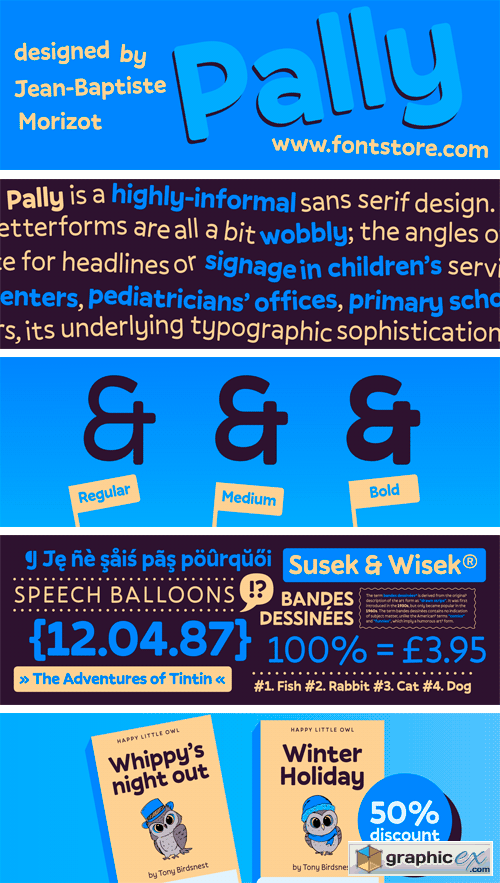
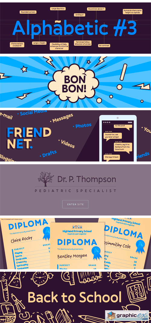
Pally is a highly-informal sans serif design. Its three weights were designed by Jean-Baptiste Morizot. Pally’s letterforms are all a bit wobbly; the angles of many letters’ strokes are atypical – just look at the capital ‘A’ – and the left and right-hand-sides of many letters are not the same size or height (e.g., the lowercase ‘a’ and ‘n’). As a result, Pally has a lot more character than most sans serif typefaces. It could be an excellent choice for headlines or signage in children’s services projects, like family centers, pediatricians’ offices, primary schools, etc. Once you begin to understand the different rhythm that Pally offers, its underlying typographic sophistication becomes clear. The ascenders of the lowercase letters, rise above the heights of capital letters and numerals. The lowercase alphabet includes a double-storey ‘a’, a single-storey ‘g’, and a Jensonian ‘e’, with a diagonal stroke in its middle-section. Each Pally weight has been drawn in a more-or-less monolinear fashion. In the fonts’ extended character sets, there is plenty of space between each letter and diacritics that come on top of it.

Bespoke Slab Font Family
Bespoke Slab is family of humanist slab serif fonts. They feature large, open counterforms, which hep maximise the typeface’s legibility in text. The family includes five weights, ranging from Light through Bold. Each weight has an upright and an italic font on offer. The tops of the Bespoke Slab’s lowercase ascenders all end in diagonal shears. This kind of diagonal stroke-ending is visible throughout the typeface’s design. It acts as a subtle reference to the kind of broad-pen that could be used to write Bespoke Slab’s letterforms out. The lowercase ‘a’ and ‘g’ in the five upright fonts are double-storied. In the italic fonts, these become single-storied. The fonts’ numerals are proportionally-spaced oldstyle figures, which harmonise especially well with the lowercase letters. Bespoke Slab is an excellent choice for use in branding, corporate communication, editorial design, and even in signage and wayfinding systems. It gets a text’s message across quickly – no matter if the text is long or short – without sacrificing its own unique and inherent voice. The Bespoke Slab fonts are a real team effort; they were designed by Jérémie Hornus, Théo Guillard, Morgane Pambrun, Alisa Nowak, and Joachim Vu.

Author Font Family
Author is a family of humanist sans serif fonts. They are optimised for use in modern publications – hence the the name ‘Author.’ Its letterforms are slightly expanded, which gives the counterforms inside of them enough space to breathe, thus increasing their legibility and helps with their on-screen rendering, too. Author’s family includes six weights, ranging from Extralight through Bold. Each weight has an upright and an italic font on offer. The uppercase letters are virtually monolinear in appearance; however, several of the lowercase letters have visible stroke contrast. The tops of Author’s strokes terminate in diagonal cuts; these are reminiscent of the broad-pen that would be used to write the humanist letterforms the typeface is based on. In Author’s upright fonts, the lowercase ‘a’ and ‘g’ are double-storied; there is a single-storey ‘g’ in the fonts as an OpenType alternate. In the italic fonts, the ‘a’ and the ‘g’ are both single-storied. The ascenders of Author’s lowercase letters a slightly taller than the tops of the capitals. The family’s fonts include both lining and oldstyle figures; in both versions, the ‘3’ has a flat top. Author comes from Satya Rajpurohit, the founder of Fontstore.

Bega Font Family
Bega is a simplified sans serif typeface. Formal reduction plays a strong role in its design. This is most visible in its ‘spurlessness.’ The visible strokes (or spurs) have been eliminated from the letterforms that would typically feature them. The lack of spurs in Bega is most-clearly visible when you look at the top-left corners of letters like ‘m’, ‘n’, and ‘r’. The Bega family includes eight weights, which range from Thin through Black. Each weight has two fonts on offer: An upright font, and an italic. Bega’s italics are obliques; their letterforms are slanted. The strokes of Bega’s letterforms all appear to be monolinear; that doesn’t mean that Bega is without contrast, however. Thanks to the family’s large number of weights – eight really is a lot – you can combine two or more of them with each other to create headlines that exhibit quite a bit of contrast! Each of Bega’s fonts includes a full range of numerators and denominators, to use when typesetting fractions, etc. The font’s numerals are proportional lining figures; these have the same height as Bega’s uppercase letters. The lowercase letters’ ascenders are tall, and they rise up above the tops of the capital letters and numerals. Bega’s friendly look makes it an ideal choice for use in corporate communication design. The typeface was designed by Sabina Chipar? and Diana Ovezea.
12 Summer Poster Design Template

12 Summer Poster Design Template 1626824
EPS | 54 MB RAR
This is a mini pack - Summer poster/flyer design template from summer collection. It is very perfect for your stationery or website in colorful, vivid style. Just enjoy and have fun!

Tennis Ball Patent 1659769
Retro Vector Tennis Ball Patent - great for creating flyers, posters, illustrations or products. You can use this licence to create your own works.

Lego Man Patent 1659707
Retro Vector lego man patent - great for creating flyers, posters, illustrations or products. You can use this licence to create your own works. One vector diagram supplied as Illustrator 8.0 eps files, which are compatible with most vector and bitmap applications such as Adobe Illustrator and Photoshop. One png file, 8" x 10 // 20x25 cm.
Ornamental Vintage Design Elements
Ornamental Vintage Design Elements 1682683
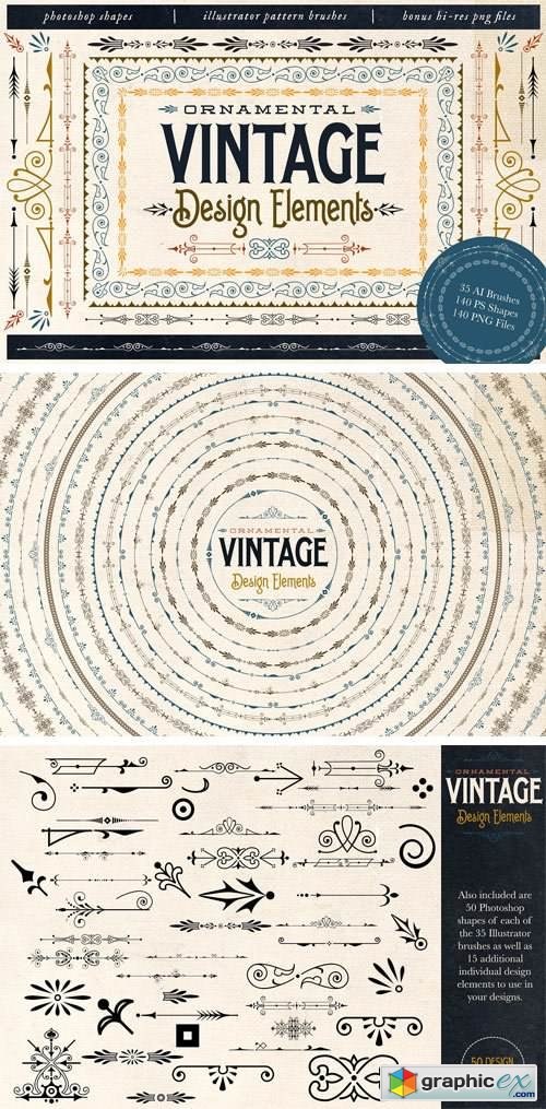
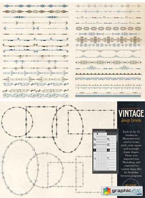
Ornamental Vintage Design Elements includes all sorts of designs pieces to enhance your vintage-inspired project. All these elements were created based on antique designs, but were recreated with smooth, clean lines. Included are Illustrator brushes, Photoshop shapes, as well as bonus hi-res png versions of each brush, shape and frame. You can easily create borders, frames and corners with these tools.
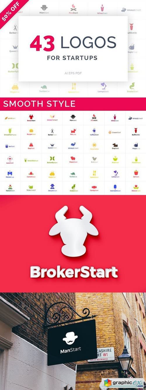
43 Startup Logos 1654922
Ai EPS | 2 MB RAR

Watercolor human organs 1653607
JPG PSD PNG | 782 MB RAR
Collection of 6 human organs: heart, brain, lungs, liver, kidney and stomach. You will get hand painted watercolor version (raster), low poly vector version and traced vector version.
Perfect for prints, stickers, labels, wall arts, placards, prints, posters or any your idea.

PEONIES. 28 STOCK PHOTOS. 1632700
JPG | 603 MB RAR
 User Panel