 User Panel
PF Regal Stencil Pro Font Family
OTF | 10 Fonts | JPEG Preview | 5.4 Mb RAR
The objective of this project was to design a new typeface series for Grazia magazine. First published in 2010, Regal was later revamped and redesigned for commercial use, evolving into a type system with five related superfamilies. According to the brief, this typeface had to be elegant, luxurious, sexy, vibrant, reflect the female sensitivity and take into consideration a modern woman who is more proud, more connected, more spontaneous, open-minded and eager to try a whole host of new products and services. Targeting this consumption-wise and well-educated woman, required a typeface that is not strictly based on classic forms, but incorporates several distinct elements that express a modern woman’s personality and the products she consumes. In that respect, a whole series of 5 related superfamilies was designed, which not only emphasize femininity but also reflect both the romantic as well as the dynamic side of the female personality. For that matter, elegant curvy details were introduced in order to create a link to the female figure; teardrop terminals which reflect a woman’s sensitivity; pronounced quirks on upper and lower arms for her eyelashes; high-contrast, sharp corners at thinning terminals for her high heels; alternate glyphs for the woman who prefers to express her individuality -rather than slavishly follow trends- by using various accessories which can dramatically change her appearance; elegant endings and long curves to reflect her predisposition to dream; bell-shaped serifs with an inward rather than outward direction which recall streamlined seventies fashion. This series of typefaces is diverse in its construction as it consists of five related superfamilies i.e. text, display, finesse, swash and stencil. There is a variety of weights which range from regular to ultra black for each one of the five families. These families share common attributes but they differ in content according to each one’s usage. The whole superfamily type system is comprised of 47 weights with an average of 898 glyphs per weight. It supports simultaneously Latin, Cyrillic and Greek and comes with many alternate glyphs.

Dulce Pro Font Family - 5 Fonts $225
OTF | 769 KB

Verdana Pro Font Family - 20 Fonts $800
OTF | 3.73 MB

ITC New Esprit Pro Font Family - 32 Font $1728
OTF | TTF | 16.8 MB

Kefa II Pro Font Family - 16 Font $480
OTF | 1.74 MB

Magic Retouch Pro
Photoshop ATN | 1.1 Mb

Pro HD Repair Kit
Photoshop ATN | 2.8 Mb
Corporate & Pro Business Card Design

Corporate & Pro Business Card Design
Photoshop PSD | Print Dimensions: 3.5x2 inch | 4.1 Mb
Corporate & Pro Business Card Dersign
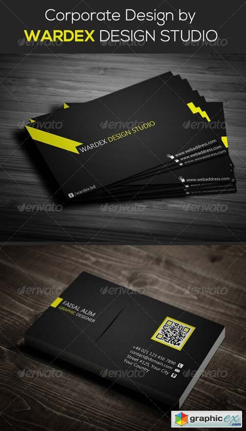
Corporate & Pro Business Card Dersign
Photoshop PSD | Print Dimensions: 3.5x2 inch | 8.3 Mb
Creative & Pro Business Card Design
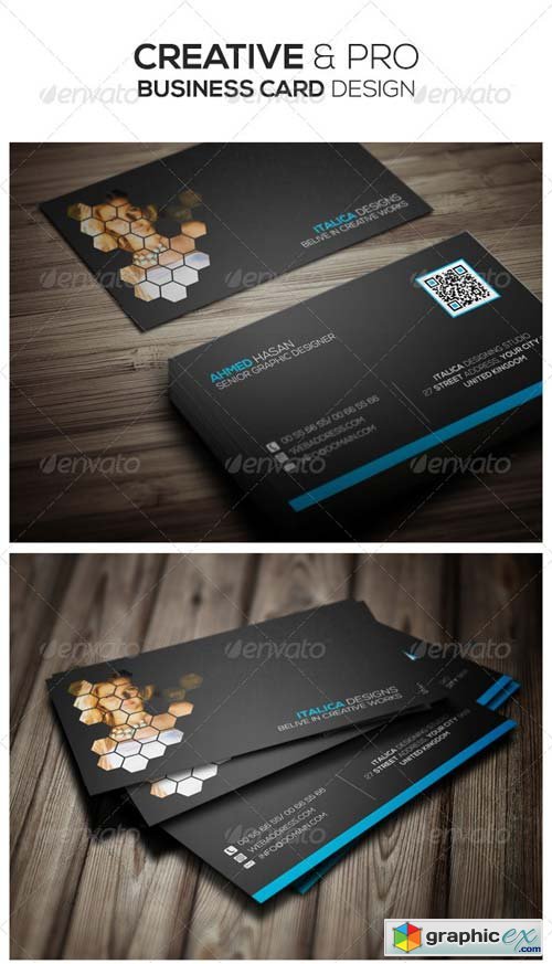
Creative & Pro Business Card Design
Photoshop PSD | Print Dimensions: 3.5x2 inch | 2.3 Mb
Pro Photographer Business Facebook Cover

Pro Photographer Business Facebook Cover
Photoshop PSD | 851x315 px | 4.2 Mb
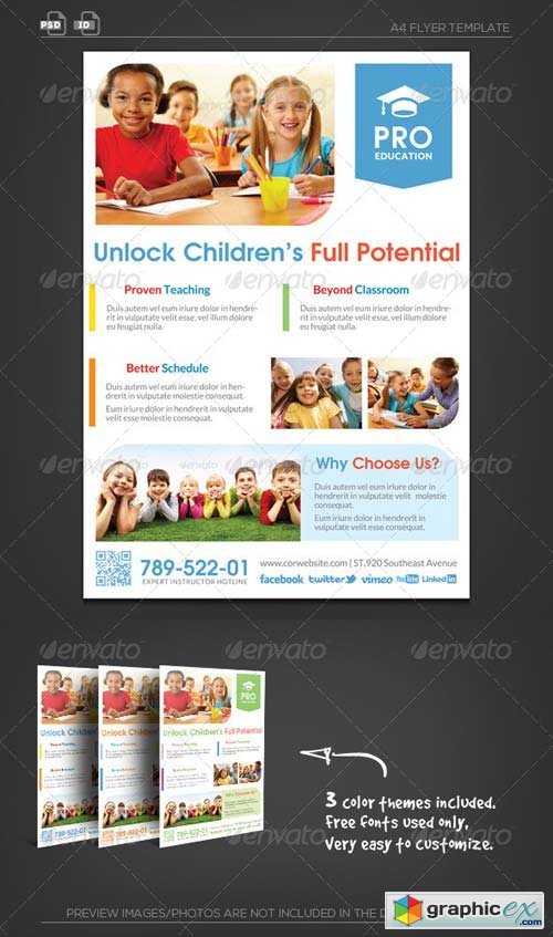
Pro Education Flyer Template - Unlock Potential
Photoshop PSD | InDesign INDD | Print Dimensions: 21.0x29.7 cm | 6 Mb
Photoshop PSD | Print Dimensions: 8x6 inch | 38.8 Mb
Vintage Passion Vol 2 | 10 Pro FX
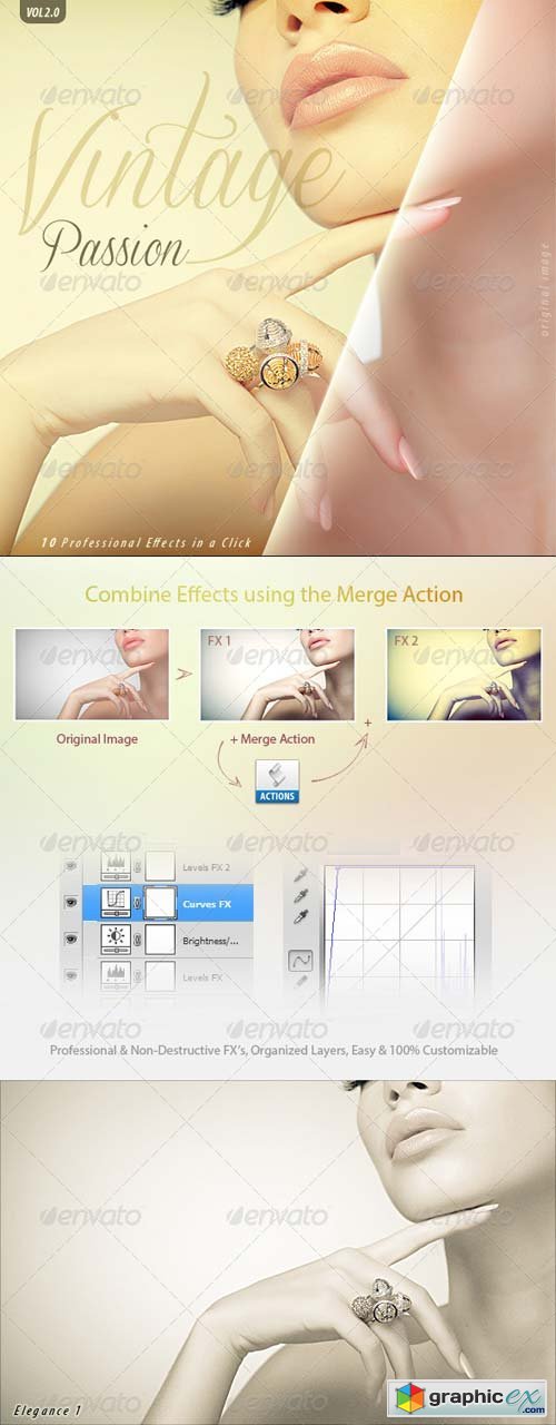
Photoshop ATN | 1.6 Mb
myBook Pro Screen Mock-up
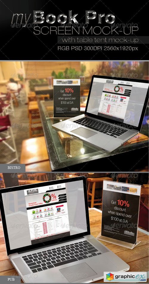
myBook Pro Screen Mock-up
Photoshop PSD | 2560x1920 px | 226.8 Mb
PRO 3d Web Showcase Mock-ups 548570

PRO 3d Web Showcase Mock-ups 548570
Photoshop PSD | 3000x1500 | 439 Mb

PF Kids Pro Font Family
This is not just a typeface inspired by a kid’s first attempts to write. This is in fact how exactly a kid writes. Alexandros Papalexis was born again kid when he became a father. This series came about while designing his daughter’s birthday invitations. Since its first release, it has been constantly on our most wanted list. You step into a supermarket, a bookstore or a clothing store and you see tens of products using this typeface. Anything from baby products, food, clothing, children’s books and magazines, print and TV campaigns, you name it. But don't just stick to the name. Every single weight serves the right purpose. This is why this typeface has also been used extensively for grown-up market. Recently, it was upgraded to include Latin, Greek and Cyrillic. Furthermore, the accompanied series of pictograms was completed and loaded with 125 western and eastern European pieces.
TTF | 3 Fonts | JPEG Preview | 5.2 Mb RAR

Espuma Pro Font Family
Espuma Pro is a soft and friendly humanist sans-serif font family with strong calligraphic aftertaste. Presented in 7 weights, with true italics each, it features the traditionally rich language support, small caps, 6 sets of figures and a bunch of ligatures. Its delicate flavor is suitable for brands that wish to communicate friendliness and openness. This typeface is especially good for FMCG and packaging, but it can be used virtually anywhere thanks to its extreme legibility.
OTF | 14 Fonts | JPEG Preview | 5.9 Mb RAR
 for $299")
Kyrial Sans Pro Font Family
Designed in 2011 by Olivier Gourvat, this font family has generous proportions with a range of weights make it a versatile family for print, text, signage, branding and web design work. Kyrial Sans Pro offers lots of OpenType goodness and broad language support.
OTF | 12 Fonts | JPEG Preview | 5.2 Mb RAR