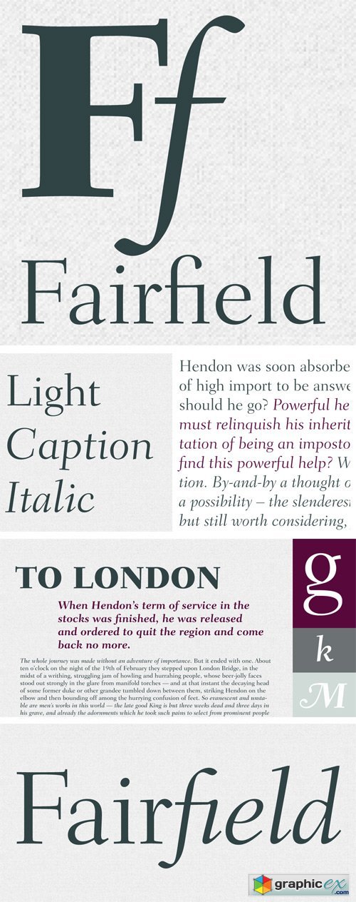
Fairfield Font Family
Fairfield is a fifty-year-old typeface that has had a recent facelift. Rudolph Ruzicka, artist and book illustrator, designed light and medium weights of Fairfield for Linotype in 1940 and 1949, respectively. For Fairfield’s 1991 release as an electronic typeface, designer Alex Kaczun added bold and heavy weights. With its straight, unbracketed serifs and abrupt contrast between thin and thick strokes, Fairfield harks back to the modern typefaces of Bodoni and Didot, but has a distinctly twentieth-century look. Fairfield is a fine text face, both for books and shorter texts. Kaczun added small capitals and old style figures, swash capitals, and a set of “caption” typefaces (sloped roman style) that were inspired by Matthew Carter's extensions to Oldstyle 7 for National Geographic magazine.
Download | Prefiles.com
Download | Rapidgator.net
Download | Nitroflare.com
Download | Turbobit.net
Comments (0)
Would you like to leave your comment? Please Login to your account to leave comments. Don't have an account? You can create a free account now.
 User Panel