 User Panel
Dobra Font Family
Dobra is a redesign of the previous released Dione. Dobra is a very geometric and robust sans typeface, specially suited for magazines and newspapers, but it works great as a corporate typeface.
TTF | 10 Fonts | JPEG Preview | 4.7 Mb RAR

Eagle Font Family
The Eagle series realizes the ideas behind Morris Fuller Benton’s famous titling, Eagle Bold, the symbol of American recovery, drawn in 1933 for the National Recovery Association. Font Bureau Eagle was started in 1989 for Publish. David Berlow designed a lowercase, finished the character set, and in 1990 added Eagle Book for setting text. In 1994, Jonathan Corum added Eagle Light and Eagle Black to form a full series.
TTF | 4 Fonts | JPEG Preview | 5.1 Mb RAR

Wurz Font Family
Wurz is a family with 32 variants. Designed for labels, titles and posters. And to play with typography in large sizes! Is a grotesque geometric. Designed on a modular basis.
OTF | 32 Fonts | JPEG Preview | 4.4 Mb RAR

The Subway Types Font Family - 3 Font $120
OTF | TTF | 1.48 MB

Synthemesc Font - 1 Font $30
OTF | TTF | 1.75 MB

St Patrick Font Family
St Patrick is a typeface inspired by medieval inscriptions but adapted to modern typography. In addition to the regular style there are 4 variants that can be combined in layers. Includes smallcaps and alternatives. This typeface is the oblique variant of the font San Benito (also from TipoType).
OTF | 5 Fonts | JPEG Preview | 7.6 Mb RAR

Special ForcesFont - 2 Font $60
OTF | TTF | 560 KB

Quiroga Serif Font Family
Quiroga Serif began in 2007 with the name Quadratta Serif. This typography was designed for continuous text, legible at medium and small sizes, with great saving of space, optimized for 6, 8, 10 and 12 points. The morphology is a mix between tradition and innovation; it has a vertical axis, thick serifs, tall x-height, light modulation and a lot of internal space between letters: key to improve legibility at small sizes.
OTF | 6 Fonts | JPEG Preview | 6.7 Mb RAR


Neue Swift Font Family - 12 Font $948
OTF | 1.26 MB

Maax Rounded Font Family- 6 Fonts $840
OTF | 638 KB

LunchBox Font - 4 Font $85
OTF | 2.63 MB

Kefa II Pro Font Family - 16 Font $480
OTF | 1.74 MB

Grandma Font Family - 2Fonts $38
OTF | 325 KB

Funboy Font - 1 Font $30
OTF | TTF | 4 MB

Courtney Font Family
Courtney is a display font, unicase, with thick and irregular strokes. It contains a varied set of ligatures that makes Courtney a very dynamic font, ideal for short texts, magazines, logos, etc. It also possesses a large amount of connectors like for example: and, the, by, among other, designed to complement the font.
OTF | 4 Fonts | JPEG Preview | 4.4 Mb RAR

Core Rhino Font Family
Core Rhino is a contemporary typefamily designed by S-Core. The fonts have the mood of brushed feeling and come across as soft and gentle. Core Rhino displays warmth through its roundness and curved letterforms. Also it is legible in prints and on screens. The Core Rhino family consists of 7weights (Thin, Extra Light, Light, Regular, Bold, Heavy, Black) plus matching italics. The OpenType fonts contain complete Latin 1252, Cyrillic, Central European 1250, Turkish 1254 character sets. Each font includes proportional figures, tabular figures, numerators, denominators, superscript, scientific inferiors, subscript, fractions. If you are looking for a sans serif style font which is practical and friendly, get this family and save your time.
OTF | 14 Fonts | JPEG Preview | 4.2 Mb RAR

Chau Trovuille Font Family
OTF | 2 Fonts | JPEG Preview | 7.1 Mb RAR

Briko Font Family
Briko is a legible hand-crafted type family that comes in two weights. Its little bit bumpy outline and soft edges give it friendly feelings. There are two versions of Briko Family; Briko and Briko Rough(textured). Perfect for a header for an article, posters or for anything needing a legible and neat hand-written type family.
OTF | 12 Fonts | JPEG Preview | 4.5 Mb RAR

Blow Up Font - 3 Font $55
OTF | 200 KB

BLAQ Font Family
Inspired by Henry W. Troy, BLAQ is a new version of Trojan Text not available as font. Is an ornamental blackletter alphabet. Works great in headlines and other ‘masculine’ like design settings. The Victorian Gothic or Neo-Gothic is an architectural movement that began in the 1740s in England. Its popularity grew rapidly in the early nineteenth century. The revived Gothic style was not limited to architecture.
OTF | 2 Fonts | JPEG Preview | 4.5 Mb RAR

Antique Spenserian Font
This antique script is based on Spencerian script released from MacKellar, Smiths, & Jordan in the 19th century. This family comes in two varieties, Standard and ornamented capitals. The Standard has orthodox style for formal text and display. This makes it possible you to use this style for any projects. The unique Ornamented is suitable for eye-catching part of your project: headlines, wedding invitations and logo. Every glyphs were added antique and distressed effect by hand work with great care to be looked like natural. Use your ideas to enjoy this exclusive script.
OTF | 1 Font | JPEG Preview | 15.3 Mb RAR

AmpleSoft Font Family
AmpleSoft is a softer version derived from Ample type family. AmpleSoft is a display type family, optical mono linear and a bit squarish in nature. It has smooth curve instead of sharp angle formed by the junction of two strokes, which is a prominent feature of its design. It is designed to be a little eye-catching yet legible. It has clear and distinguishable letterforms, which helps to elaborate and emphasis the message. It is graphically strong and command viewerís attention. The overall appearance of type is suitable in setting it as heading, title, headline, etc. The type family consists of six weights viz. Thin, ExLight, Light, Regular, Medium and Bold. Considering the nature of this type family, italics have been excluded. AmpleSoft is designed by Aakash Soneri in the year 2014.
OTF | 6 Fonts | JPEG Preview | 4.4 Mb RAR

Amasis Font Family - 10 Fonts $290
OTF | 329 KB
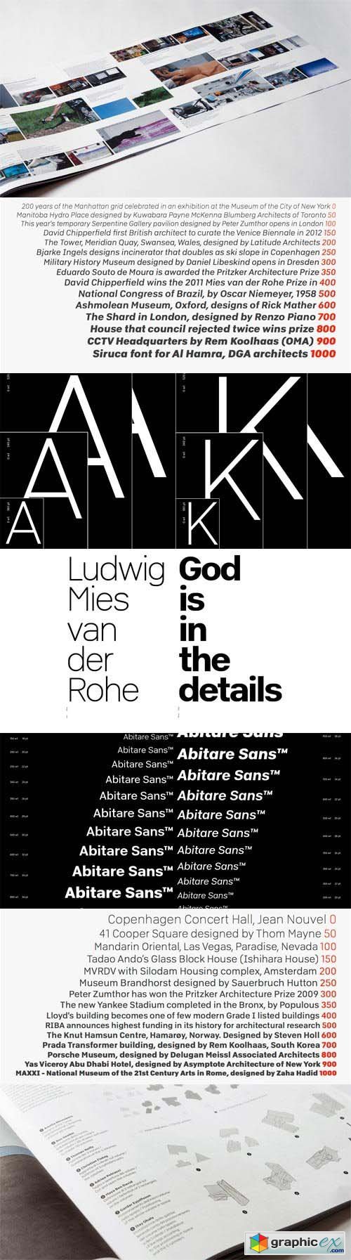
Abitare Sans Font Family
Abitare Sans was originally commissioned by the group Rizzoli Corriere della Sera. It’s a typeface of 30 weights designed to be used in Abitare magazine. The request of the president Mario Piazza was a new CP Company with some redesigned glyphs, but the result is a radical evolution of its concept being intended to be used as a font for text far more readable. In Abitare Sans was kept the geometric structure without neglecting the numerous editorials requirements.
TTF | 30 Fonts | JPEG Preview | 12.4 Mb RAR

Zulia Font - 1 Font $59
OTF | 638 KB

Undersong Font Family- 6 Fonts $247
OTF | 8.64 MB

Two Fingers Font Family- 20 Fonts $700
OTF | 4.03MB

Stereo Gothic Font Family
The concept of this font is very simple. Wide and Legible, No decorative, just simple. The variety of weights make your design more flexible.
OTF | 36 Fonts | JPEG Preview | 7.2 Mb RAR

Simplo Font Family
Simplo is a geometric sans serif typeface, built in sixteen styles. It is a tribute to the 1930s typeface Semplicita, designed by Nebiolo’s Alessandro Butti. Although many details of Simplo differ from Semplicita, it preserves the spirit of the original. Simplo is ideal for use in display sizes. It is also quite legible in text, and is well suited for graphic design and corporate identity design. Simplo has sixteen styles, extensive language support, eight different kinds of figures, sophisticated OpenType features — so it’s ready for advanced typographic projects. The most notable characteristics of this typeface are the t and the f. The t is the culmination of simplicity: a vertical line with just a simple right-side crossbar. The f also has just a right-side crossbar, and is really tall: it reaches both the highest and lowest vertical position of the typeface. The top of the distinctive s, is much narrower than its bottom. The a, b, d, g, p, q, and u are spurless, and show a family resemblance with Hans Reichel’s 1990s typeface Dax. However, these letters are rounder and more geometric than Dax’s counterparts, because of Dax’s higher x-height and narrower design. In Paul Shaw’s Imprint article about typefaces that have been overlooked and/or underappreciated, “Overlooked Typefaces”, he concluded his discussion of Semplicita as follows: “These idiosyncrasies suggest that Semplicita might find a warm reception today, given the current love affair with Gotham, Neutraface and Proxima—and the resurgence of ITC Avant-Garde Gothic.”
OTF | 16 Fonts | JPEG Preview | 4.5 Mb RAR

Sigmund Freud Font Family - 6 Fonts $191
OTF | TTF | 6.31 MB

Sharp Sans Font Family
Lucas Sharp’s first release through Village debuts in the Incubator. Sharp Sans injects some much needed humanism into the Futura model. With its sheered terminals and true italics, Sharp Sans combines the appealing typographic compensation of the grotesque, with the plump circular bowls of the geometric. The result is a typeface suited for both text and display use that breaths life into the genre of the geometric sans.
OTF | 20 Fonts | JPEG Preview | 4.1 Mb RAR

Reina Font Family - 8 Fonts $225
OTF | 638 KB

Nanami Font Family - 18 Fonts $337
OTF | 638 KB

Muzarela Font Family
OTF | 50 Fonts | JPEG Preview | 4.3 Mb RAR