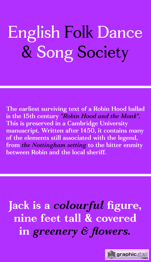
Fortescue Font Family
In April 2009 The Entente was commissioned to design an on-going identity for artist and printmaker, Jake Spicer. The project’s bespoke typeface, was re-cut multiple times over a period of 9 months (becoming a personal labour of love), before arriving at the current commercial cut. The name ‘Fortescue’ is derived from a dwelling in Sidmouth, Devon, England where Spicer began his career. The Pro set comes complete with extended characters for use in Eastern & Central European languages. Full OpenType features include contextual ligatures, discretional ligatures, superior & inferior numbers, fractions, oldstyle proportional figures, proportional and tabular lining figures and a full set of small caps. Please note that the pro set features are in addition to the standard weights.
Download | Prefiles.com
Download | Rapidgator.net
Download | Nitroflare.com
Download | Turbobit.net
Comments (0)
Would you like to leave your comment? Please Login to your account to leave comments. Don't have an account? You can create a free account now.
 User Panel