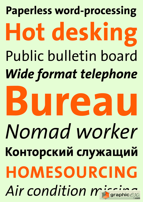
TheSans Office Font Family
TheSans is part of the Thesis superfamily which Luc(as) de Groot first published in 1994. During the past decade and a half, TheSans has come to epitomize the useful-yet-friendly, all-purpose contemporary sans-serif. It has become the face of thousands of organisations, publications and web sites, making it one of the most widely used sans-serifs world-wide. Thesis was conceived as a versatile typographic system of ambitious scope. It grew out of a dissatisfaction with the limited range of good typefaces available for corporate identity projects. It aims to fill that gap by providing the user with three compatible styles – TheSans, TheMix and TheSerif – in an optically harmonious range of eight weights, including real italics for each weight. TheSans is a low-contrast typeface – i.e., the differences between thin and thick strokes are not very pronounced. Yet the reference to writing with the broad-nibbed pen is still present, giving the letters a diagonal stress and a forward flow that facilitates reading. The roman letterforms tend to have some characteristics of an italic or written construction. Yet the italic forms themselves are very distinctive: they were not derived from the upright but were individually designed while perfectly complementing the roman forms.
Download | Prefiles.com
Download | Rapidgator.net
Download | Nitroflare.com
Download | Turbobit.net
Comments (0)
Would you like to leave your comment? Please Login to your account to leave comments. Don't have an account? You can create a free account now.
 User Panel