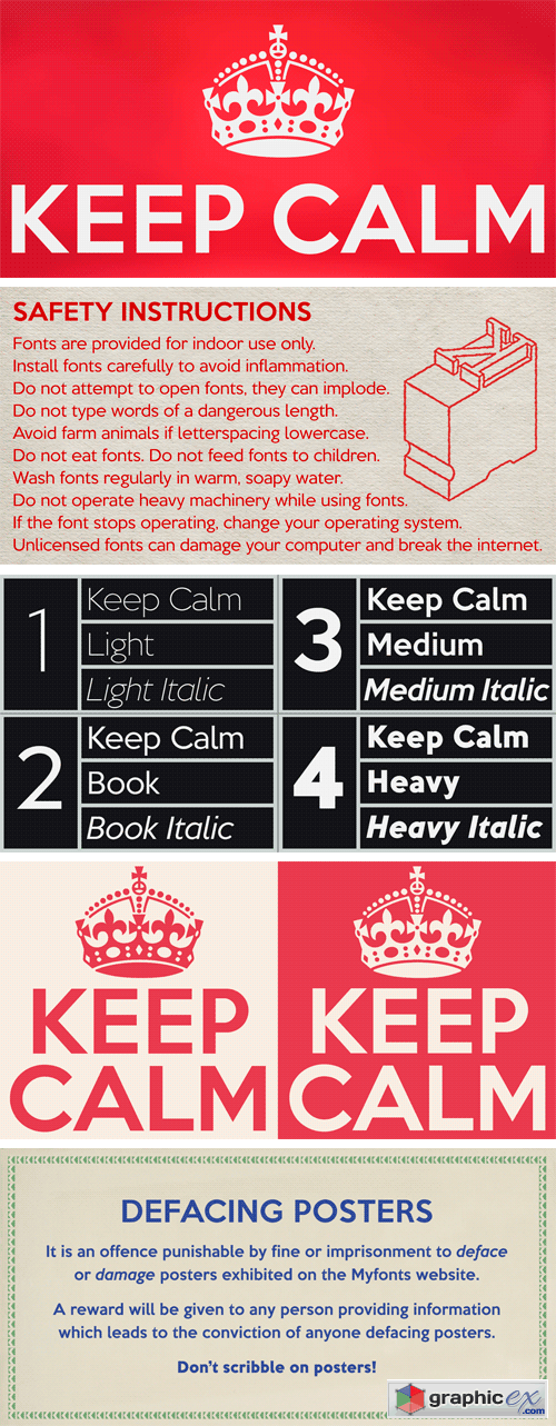
Keep Calm Font Family (Incomplete)
Developing the Keep Calm typeface has been an exercise in extrapolation; an intriguing challenge to build a whole, high quality font family based on the twelve available uppercase letters of the Keep Calm poster, and on similar lettering from the other two posters in the original series. This has required the creation of complementary lowercases that are believably 1939; that maintain the influence of Gill and Johnston while also hinting at the functional imperative of a wartime drawing office. The draughtsman was balancing intuitive, human qualities and the pure pleasure of drawing elegant contemporary letters, against an underlying geometry of ruled lines, perfect circles, 45° terminals, and a requirement for no-nonsense clarity.
Download | Prefiles.com
Download | Rapidgator.net
Download | Nitroflare.com
Download | Turbobit.net
Comments (0)
Would you like to leave your comment? Please Login to your account to leave comments. Don't have an account? You can create a free account now.
 User Panel