The Sketchnote Typeface Font Family - 5 Fonts for $99

The Sketchnote Typeface Font Family
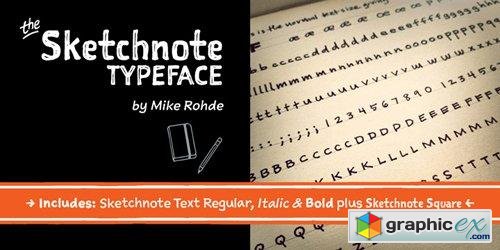
The Sketchnote Typeface was born of necessity: veteran designer and illustrator Mike Rohde needed a series of hand-drawn fonts to produce his recent book, The Sketchnote Handbook (2012, Peachpit Press). Because of its origin, the typeface was designed to be practical, to convey the human character and quirks of Rohde’s normal handwriting and unique hand-drawn lettering with the benefits inherent in digital fonts. Sketchnote Square is a bold, somewhat compressed headline type that complements the Sketchnote Text fonts. Drawn instead of written, the characters in Square have neat little happenstance voids within the strokes. Square also includes a handy selection of fun icons, rules, and arrows—some functional tidbits for your design projects. They are accessible via the OpenType feature “Ornaments” or “Stylistic Set 2” For added convenience, those same fun icons, rules, and arrows are also available as a standalone font, Sketchnote Dingbats, which comes packaged with Square and the full family package. The texture of Sketchnote is the result of actual ink-spread on paper, captured in scans of the written letterforms and left intact during production to preserve that feeling. Under the hood, the texture was carefully edited by hand, eliminating outline errors and keeping the point count low for optimal performance. These fonts are crafted to the highest industry standards. Sketchnote Square is best used at larger sizes for headlines, titles, packaging, etc. Sketchnote is great for a variety of projects where a handcrafted aesthetic and ease-of-use are desired.
OTF | 5 Fonts | JPEG Preview | 1.9 Mb RAR
Download | Prefiles.com
Download | Rapidgator.net
Download | Nitroflare.com
Download | Turbobit.net
Comments (0)
Would you like to leave your comment? Please Login to your account to leave comments. Don't have an account? You can create a free account now.
 User Panel