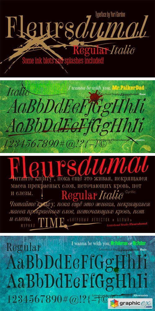
Fleursdumal Font Family
How should an authentic baudelairean type look like? Aesthetically beautiful, that’s for sure. Intellectual, neurotic. Uptight — oh, the conventions of the time. Easily readable — still 20 years to go until the age of art nouveau with its outrage of typefaces. It may have a vibe of a Paris salon - salute to the Parnassiens. Such a modern-class (don’t mix it with the modern-styled) pharmaceutical Antiqua. Contrasts, thin serifs, the integrity of the operating theatre. But Baudelaire is not Heredia. «Une charogne» is not that much a vivid metaphor as a drawing from nature. The baudelairean typeface should have its cavern, flow, dark side. Not to demonstrate the fragile romantic profile of a cursed poet, as Baudelaire was seen 130 years ago, but to express the real pain. A true, unattractive, egoistic, suicidal passion.
OTF | 2 Fonts | + JPG Preview
Right now! Register a PREMIUM account on Prefiles For Fast Download
Download | Prefiles.com
Download | Rapidgator.net
Download | Nitroflare.com
Download | Turbobit.net
Download | Prefiles.com
Download | Rapidgator.net
Download | Nitroflare.com
Download | Turbobit.net
Dear visitor, you went to the site as unregistered user. We encourage you to create a free account and Login
Comments (0)
Information
Would you like to leave your comment? Please Login to your account to leave comments. Don't have an account? You can create a free account now.
Would you like to leave your comment? Please Login to your account to leave comments. Don't have an account? You can create a free account now.
 User Panel