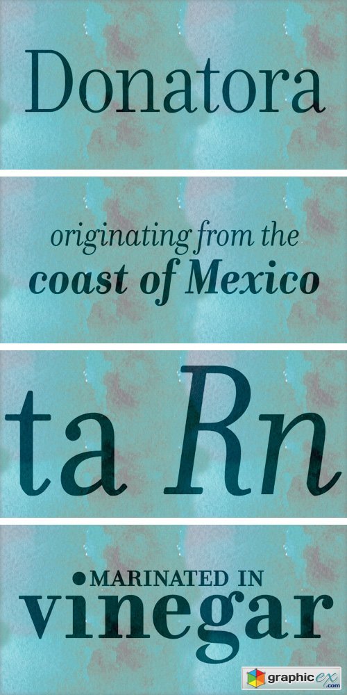
Donatora Font Family
OTF, TTF | 30 Fonts | + JPG Preview
Donatora was an attempt to soften a modern Bodoni and give it the characteristics of highly legibily text font. Gone is the sharp 90-degree angle of the bracket, in is the rounded, slighly heavier serif and a miniscule bracket. Modulation and stresses have been minimized in everything but the display weights. A chiseled transition was used frequently to reolve the connections between vertical stresses with the end of a serif or the resolution of a ball terminal. The italic is heavily inspired from sections of Bodoni's Manuale Tipografico with severe resolutions accomplished with the a more chiseled italic and the departure from some obliqued variants currently on the market. This chiseled transition is adopted as well but with greater severity.
Download | Prefiles.com
Download | Rapidgator.net
Download | Nitroflare.com
Download | Turbobit.net
Comments (0)
Would you like to leave your comment? Please Login to your account to leave comments. Don't have an account? You can create a free account now.
 User Panel