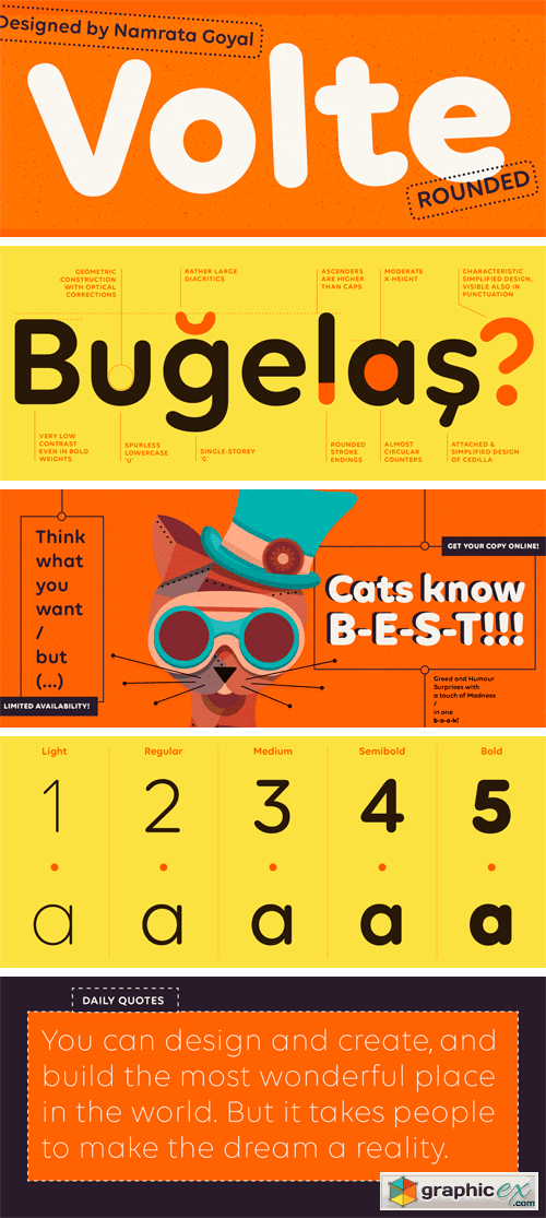
Volte Rounded Font Family
OTF | 5 Fonts | + JPG Preview
As a follow-up to our popular Volte Devanagari and Volte Latin families, Volte Rounded adds five additional fonts to this series. Volte Rounded is a geometric sans serif typeface with rounded stroke endings. These aren’t softened-up corners, but rather full-on sausage-style terminals. Aside from geometry, reduction is the biggest principle behind Volte Rounded’s design. Volte Rounded’s letterforms are low-contrast, even in the bolder weights. The high degree of design simplification is even visible in the typeface’s diacritics and punctuation marks. Because Volte Rounded’ proportions are so geometric, the outer shapes of letters like ‘C’, ‘D’, ‘O’, ‘c’, ‘o’, etc. are very similar. The exterior curves of the ‘O’ and ‘o’ are close to being perfect circles, too, as are many of the typeface’s counterforms. In each font, the letter-spacing settings reflect the counters’ sizes; this means that the advance widths of the Bold’s characters are actually narrower than those of the Light. Volte Rounded’s numerals are narrow so that they easily fit into strings of either uppercase or lowercase text.
Download | Prefiles.com
Download | Rapidgator.net
Download | Nitroflare.com
Download | Turbobit.net
Comments (0)
Would you like to leave your comment? Please Login to your account to leave comments. Don't have an account? You can create a free account now.
 User Panel