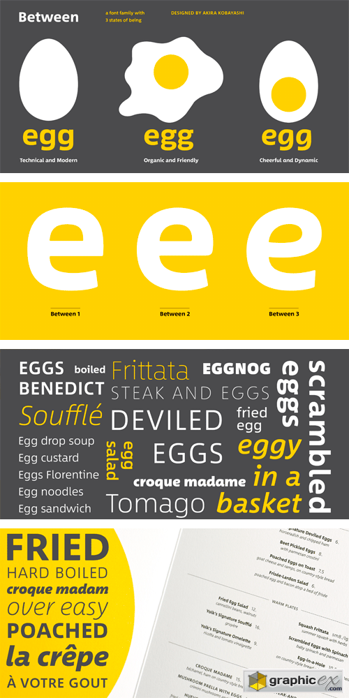
Between Font Family
OTF | 48 Fonts | + JPG Preview
There are three states to Akira Kobayashi’s Between™ typeface and, while different from each other, they all offer a human-centered design to ensure that copy set in them is affable and approachable. An added benefit is the ability to transition “between” the designs, choosing different styles – or even individual characters – to create hierarchy, contrast or emphasis. Kobayashi designed the Between typeface in response to the current use of rounded and humanist sans serif designs, over the cool grotesques of the 20th century. Between 1, melds industrial and humanistic sans serif design ethics. Between 2 is based on the idea of sans serif version of Kobayashi’s Cosmiqua® typeface. It strikes a balance between being crisp and legible, and organic and friendly. Between 3 is a freestyle sans with an uplifting sprightly mien. Between has 48 styles and each has eight weights of roman – each with an italic counterpart. The family also benefits from a large set of alternative glyphs and many OpenType® features.
Download | Prefiles.com
Download | Rapidgator.net
Download | Nitroflare.com
Download | Turbobit.net
Comments (0)
Would you like to leave your comment? Please Login to your account to leave comments. Don't have an account? You can create a free account now.
 User Panel