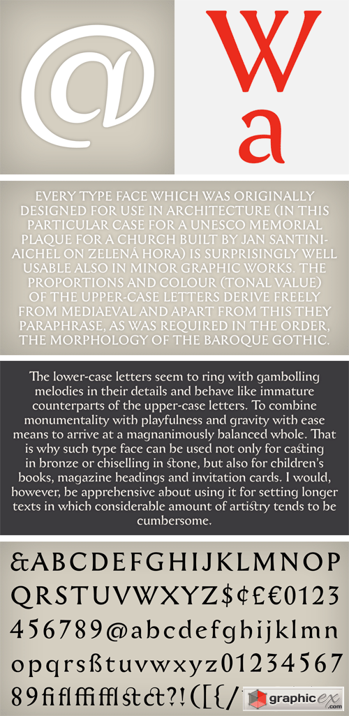
Aichel Font
Every type face which was originally designed for use in architecture (in this particular case for a UNESCO memorial plaque for a church built by Jan Santini-Aichel on Zelená Hora) is surprisingly well usable also in minor graphic works. The proportions and colour (tonal value) of the upper-case letters derive freely from Mediaeval and apart from this they paraphrase, as was required in the order, the morphology of the Baroque Gothic. The lower-case letters seem to ring with gambolling melodies in their details and behave like immature counterparts of the upper-case letters. To combine monumentality with playfulness and gravity with ease means to arrive at a magnanimously balanced whole. That is why such type face can be used not only for casting in bronze or chiselling in stone, but also for children's books, magazine headings and invitation cards. I would, however, be apprehensive about using it for setting longer texts in which considerable amount of artistry tends to be cumbersome.
Download | Prefiles.com
Download | Rapidgator.net
Download | Nitroflare.com
Download | Turbobit.net
Comments (0)
Would you like to leave your comment? Please Login to your account to leave comments. Don't have an account? You can create a free account now.
 User Panel