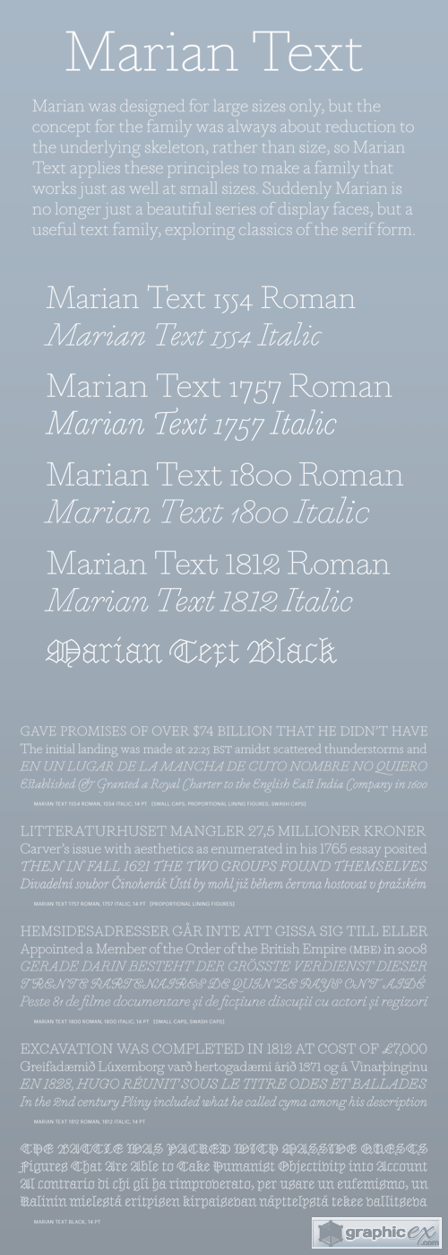
Marian Text Font Family
Marian was designed for large sizes only, but the concept for the family was always about reduction to the underlying skeleton, rather than size, so Marian Text applies these principles to make a family that works just as well at small sizes. Suddenly Marian is no longer just a beautiful series of display faces, but a useful text family, exploring classics of the serif form. In the original, nine styles of the serif genre were rendered as ultra thin slab serifs, from the Renaissance of the sixteenth century through to the Scotch Roman of the early nineteenth century. Marian Text is a compendium of Marian’s ‘greatest hits’: Marian Text 1554 depicts the old style of Garamond & Granjon; John Baskerville’s transitional form becomes Marian Text 1757; the modern of Bodoni, with swash capitals and all, becomes Marian Text 1800, and the early Moderns of the Scottish foundries of Alexander Wilson & Son of Glasgow, and William Miller of Edinburgh, become Marian Text 1812. And like the original, a black letter: Marian Text Black, referencing the forms of Hendrik van den Keere.
Download | Prefiles.com
Download | Rapidgator.net
Download | Nitroflare.com
Download | Turbobit.net
Comments (0)
Would you like to leave your comment? Please Login to your account to leave comments. Don't have an account? You can create a free account now.
 User Panel